7 Split-Plot Designs
In this chapter we are going to learn something about experimental designs that contain experimental units of different sizes, with different randomizations. These so-called split-plot designs are maybe the most misunderstood designs in practice; therefore, they are often analyzed in a wrong way. Unfortunately, split-plot designs are very common, although they are not always conducted on purpose or consciously. The good message is that once you know how to detect these designs, the analysis is straightforward, we just have to add the proper random effects to the model.
7.1 Introduction
We start with a fictional example. Farmer John has eight different plots of land. He randomizes and applies two fertilization schemes, control and new, in a balanced way to the eight plots. In addition, each plot is divided into four subplots. In each plot, four different strawberry varieties are randomized to the subplots. John is interested in the effect of fertilization scheme and strawberry variety on fruit mass. Per subplot, he records the fruit mass after a certain amount of time. This means we have a total of \(8 \cdot 4 = 32\) observations.
The design is outlined in Table 7.1. There, the eight plots appear in the different columns. The fertilization scheme is denoted by control (ctrl) and new and as shaded text. A subplot is denoted by an individual cell in a column. Strawberry varieties are labelled using \(A\) to \(D\). In the actual layout, the eight plots were not located side-by-side.
|
|
|
|
|
|
|
|
We first read the data and check the structure.
book.url <- "http://stat.ethz.ch/~meier/teaching/book-anova"
john <- readRDS(url(file.path(book.url, "data/john.rds")))
str(john)
## 'data.frame': 32 obs. of 4 variables:
## $ plot : Factor w/ 8 levels "1","2","3","4",..: 1 1 1 1 2 2 ...
## $ fertilizer: Factor w/ 2 levels "control","new": 1 1 1 1 1 1 ...
## $ variety : Factor w/ 4 levels "A","B","C","D": 1 2 3 4 1 2 ...
## $ mass : num 8.9 9.5 11.7 15 10.8 11 ...Information about the two treatment variables can be found in factor
fertilizer, with levels control and new, and factor variety, with levels
A, B, C and D. The response is given by the numerical variable mass.
Here, we also have information about the plot of land in factor plot, with
levels 1 to 8, which will be useful to better understand the design and for
the model specification later on.
If we consider the two treatment factors fertilizer and variety, the design
looks like a “classical” factorial design at first sight.
xtabs(~ fertilizer + variety, data = john)## variety
## fertilizer A B C D
## control 4 4 4 4
## new 4 4 4 4When considering plot and fertilizer, we see that for example plot 1 only
contains level control of fertilizer, while plot 3 only contains level
new. We get the same pattern as in Table 7.1.
xtabs(~ fertilizer + plot, data = john)## plot
## fertilizer 1 2 3 4 5 6 7 8
## control 4 4 0 4 0 4 0 0
## new 0 0 4 0 4 0 4 4Note that we can typically not recover the randomization procedure from a data-frame alone. We really need the whole “story”.
We can visualize the data with an interaction plot which shows that mass is larger on average with the new fertilization scheme. In addition, there seems to be a variety effect. The interaction is not very pronounced (the variety effect seems to be consistent across the two fertilization schemes).
with(john, interaction.plot(x.factor = variety,
                            trace.factor = fertilizer,
                            response = mass))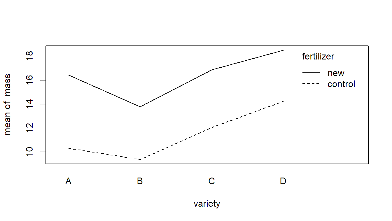
How can we model such data? To set up a correct model, we have to carefully study the randomization protocol that was applied. There were two randomizations involved here:
- fertilization schemes were randomized and applied to plots of land.
- strawberry varieties were randomized and applied to subplots.
Hence, an experimental unit for fertilizer is given by a plot of land, while for strawberry variety, the experimental unit is given by a subplot.
This design is an example of a split-plot design. Fertilization scheme is the so-called whole-plot factor and strawberry variety is the split-plot factor. A whole-plot is given by a plot of land and a split-plot by a subplot of land. For an illustration, see again Table 7.1.
As we have two different sizes of experimental units, we also need two error
terms to model the corresponding experimental errors. We need one error term
“acting” on the plot level and another one on the subplot level, which is the
level of an individual observation. Let \(y_{ijk}\) be the observed mass of the
\(k\)th replicate of a plot with fertilization scheme \(i\) and strawberry variety
\(j\). We use the model
\[\begin{equation}
Y_{ijk} = \mu + \alpha_i + \eta_{k(i)} + \beta_j +
(\alpha\beta)_{ij} + \epsilon_{ijk}, \tag{7.1}
\end{equation}\]
where \(\alpha_i\) is the fixed effect of fertilization scheme, \(\beta_j\) is the
fixed effect of strawberry variety and \((\alpha\beta)_{ij}\) is the corresponding
interaction term. We call \(\eta_{k(i)}\) the whole-plot
error. The nesting notation ensures that we get a
whole-plot error per plot of land (you can also think that the combination of
fertilization scheme and replicate number identifies a plot). The mathematical
notation is a bit cumbersome here, the model specification shown later in R will be
easier. At the end we have \(\epsilon_{ijk}\) which is the so-called split-plot
error (the “usual” error term acting on the level of
an individual observation). We use the assumptions
\[
\eta_{k(i)} \, \textrm{ i.i.d.} \sim N(0, \sigma_{\eta}^2), \quad
\epsilon_{ijk} \, \textrm{ i.i.d.} \sim N(0, \sigma^2),
\]
and independence between \(\eta_{k(i)}\) and \(\epsilon_{ijk}\). The first part
\[
\alpha_i + \eta_{k(i)}
\]
of model formula (7.1) can be thought of as the
“reaction” of an individual plot of land on the \(i\)th fertilization scheme.
All plot specific properties are included in the whole-plot error \(\eta_{k(i)}\).
The fact that all subplots on the same plot share the same whole-plot error has
the side effect that observations from the same plot are modeled as correlated
data. The following part
\[
\beta_j + (\alpha\beta)_{ij} + \epsilon_{ijk}
\]
is the “reaction” of the subplot on the \(j\)th variety, including a potential
interaction with the \(i\)th fertilization scheme. All subplot specific
properties can now be found in the split-plot error \(\epsilon_{ijk}\).
If we only consider fertilization scheme, we do a completely randomized design here, with plots as experimental units. The first part of model formula (7.1) is actually the corresponding model equation of the corresponding one-way ANOVA. On the other hand, if we only consider variety, we could treat the plots as blocks and would have a randomized complete block design on this “level,” including an interaction term; this is what we see in the second part of model formula (7.1).
To fit such a model in R, we use a mixed model approach. The whole-plot error,
acting on plots, can easily be incorporated with (1 | plot). The split-plot
error, acting on the subplot level, is automatically included, as it is on the
level of individual observations. Hence, we end up with the following function
call.
The \(F\)-tests can as usual be obtained with the function anova.
anova(fit.john)## Type III Analysis of Variance Table with Satterthwaite's method
## Sum Sq Mean Sq NumDF DenDF F value Pr(>F)
## fertilizer 137.4 137.4 1 6 68.24 0.00017
## variety 96.4 32.1 3 18 15.96 2.6e-05
## fertilizer:variety 4.2 1.4 3 18 0.69 0.56951The interaction is not significant while the two main effects are. Let us have a
closer look at the denominator degrees of freedom for a better understanding of
the split-plot model. We observe that for the test of the main effect of
fertilizer we only have six denominator degrees of freedom. Why? Because as
described above, we basically performed a completely randomized design with
eight experimental units (eight plots of land) and a treatment factor having
two levels (control and new). Hence, the error has \(8 - 1 - 1 = 6\) degrees
of freedom. Alternatively, we could also argue that we should check whether the
variation between different fertilization schemes is larger than the variation
between plots getting the same fertilization scheme. The latter is given by the
whole-plot error having (only!) \(2 \cdot (4 - 1) = 6\) degrees of freedom, as it
is nested in fertilizer.
In contrast, variety (and the interaction fertilizer:variety) are tested
against the “usual error term”: We have a total of 32 observations, leading to
31 degrees of freedom. We use 1 degree of freedom for fertilizer, 6 for the
whole-plot error (see above), 3 for variety and another 3 for the interaction
fertilizer:variety. Hence, the degrees of freedom that remain for the
split-plot error are \(31 - 1 - 6 - 3 - 3 = 18\). Another way of thinking is that
we can interpret the experiment on the split-plot level as a randomized complete
block design where we block on the different plots which uses 7 degrees of
freedom. Both the main effect of variety and the interaction effect
fertilizer:variety use another 3 degrees of freedom each such that we arrive
at 18 degrees of freedom for the error term.
7.2 Properties of Split-Plot Designs
Why should we use split-plot designs? Typically, split-plot designs are suitable for situations where one of the factors can only be varied on a large scale. For example, fertilizer or irrigation on large plots of land. While “large” was literally large in the previous example, this is not always the case. Let us consider an example with a machine running under different settings using different source material. While it is easy to change the source material, it is much more tedious to change the machine settings. Or machine settings are hard to vary. Hence, we do not want to change them too often. We could think of an experimental design where we change the machine setting and keep using the same setting for different source materials. This means we are not completely randomizing machine setting and source material. This would be another example of a split-plot design where machine settings is the whole-plot factor and source material is the split-plot factor. Using this terminology, the factor which is hard to change will be the whole-plot factor.
The price that we pay for this “laziness” on the whole-plot level is less
precision, or less power, for the corresponding main effect because we have much
fewer observations on this level. We did not apply the whole-plot treatment
very often; therefore, we cannot expect our results to be very precise. This can
also be observed in the ANOVA table in Section 7.1.
The denominator degrees of freedom of the main effect of fertilizer (the
whole-plot factor) are only 6. Note that the main effect of the split-plot
factor and the interaction between the split-plot and the whole-plot factor are
not affected by this loss of efficiency. In fact, on the split-plot level, we are
doing an efficient experiment as we block on the whole-plots (see also the
explanation in Section 7.1).
Split-plot designs can be found quite often in practice. Identifying a split-plot design needs some experience. Often, a split-plot design was not done on purpose and hence the analysis does not take into account the special design structure and is therefore wrong. Typical signs for split-plot designs are:
- Some treatment factor is constant across multiple time-points, e.g., a whole week, while another changes at each time-point, e.g., each day.
- Some treatment factor is constant across multiple locations, e.g., a large plot of land, while another changes at each location, e.g., a subplot.
- When planning an experiment: Thoughts like, “It is easier if we do not change these settings too often …”.
If we are not taking into account the special split-plot structure, the results on the whole-plot level will typically be overly optimistic, which means that p-values are too small, confidence interval are too narrow, etc. (see also the example later in Section 7.3). Again, there is no free lunch, this is the price that we pay for the “laziness.” More information can for example be found in Goos, Langhans, and Vandebroek (2006).
Split-plot designs can of course arise in much more complex situations. We could,
for example, extend the original design in the sense that we do a randomized
complete block design or some factorial treatment structure on the whole-plot
level. If we have more than two factors, we could also do a so-called
split-split-plot design having one additional “layer,” meaning that we would
have three sizes of experimental units: whole plots, split plots and
split-split plots. To specify the correct model, we simply have to inspect the
randomization protocol. For every size of experimental unit we use a random
effect as error term to model the corresponding experimental error. From a
technical point of view, it is often helpful to define “helper variables” which
define the corresponding experimental units. For example, we could have an extra
variable PlotID which enumerates the different plots, as was the case with
the original example in Section 7.1. A whole book
about split-plot and related designs is Federer and King (2007). A discussion about
efficiency considerations can for example be found in Bradley Jones and Nachtsheim (2009).
We conclude with an additional example.
7.3 A More Complex Example in Detail: Oat Varieties
To illustrate a more complex example, we consider the data set oats from the
package MASS (Venables and Ripley 2002). We actually already saw an aggregated version of
this data set in Section 5.2.
## 'data.frame':    72 obs. of  4 variables:
##  $ B: Factor w/ 6 levels "I","II","III",..: 1 1 1 1 1 1 ...
##  $ V: Factor w/ 3 levels "Golden.rain",..: 3 3 3 3 1 1 ...
##  $ N: Factor w/ 4 levels "0.0cwt","0.2cwt",..: 1 2 3 4 1 2 ...
##  $ Y: int  111 130 157 174 117 114 ...
The description in the help page (see ?oats) is, “The yield of oats from a
split-plot field trial using three varieties and four levels of manurial
treatment. The experiment was laid out in 6 blocks of 3 main plots, each split
into 4 sub-plots. The varieties were applied to the main plots and the manurial
treatments to the sub-plots.” This means compared to Section 5.2, we now
have an additional factor N which gives us information about the nitrogen
(manurial) treatment. In Section 5.2 we simply used the average
values across all nitrogen treatments as the response.
A visualization of the design for the first block can be found in Table
7.2. The whole-plot factor V (variety) is randomized and
applied to plots (columns in Table 7.2), the split-plot
factor N (nitrogen) is randomized and applied to subplots in each plot (cells
within the same column in Table 7.2). See also Yates (1935) for
a more detailed description of the actual layout (which was in fact a 2-by-2
layout for the subplots).
|
Block I
|
||
|---|---|---|
| Golden.rain | Marvellous | Victory |
| 0.6 cwt | 0.0 cwt | 0.0 cwt |
| 0.2 cwt | 0.6 cwt | 0.4 cwt |
| 0.4 cwt | 0.2 cwt | 0.2 cwt |
| 0.0 cwt | 0.4 cwt | 0.6 cwt |
Interaction plots for all blocks can be easily produced with the package ggplot2.
library(ggplot2)
ggplot(aes(x = N, y = Y, group = V, colour = V), data = oats) + geom_line() +
  facet_wrap(~ B) + theme_bw()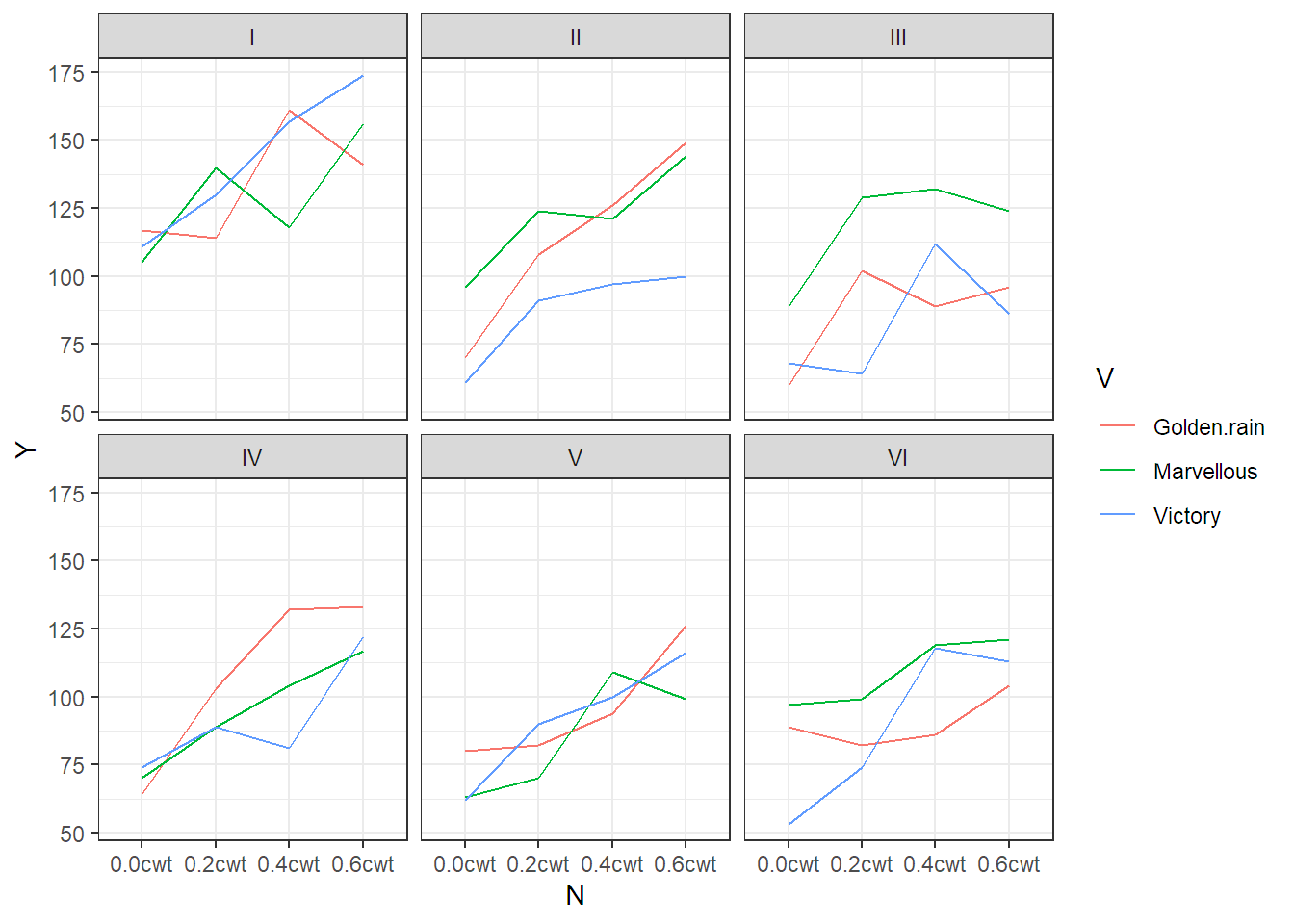
FIGURE 7.1: Interaction plots for each block of the oats data set. Blocks are labelled with Roman numerals.
In Figure 7.1
we can observe that blocks are different (this is why we use them), there is no
clear effect of variety (V), but there seems to be a more or less linear
effect of nitrogen (N).
What model can we set up here? Let us again have a closer look at the randomization scheme that was applied. With respect to variety we have a randomized complete block design. This is the whole-plot level, and we need to include the corresponding whole-plot error (on each plot).
Here, a plot can be identified by the combination of the levels of B and V.
Hence, the whole-plot error can be written as (1 | B:V). This leads to the
following call of lmer.
fit.oats <- lmer(Y ~ B + V * N + (1 | B:V), data = oats)
anova(fit.oats)## Type III Analysis of Variance Table with Satterthwaite's method
## Sum Sq Mean Sq NumDF DenDF F value Pr(>F)
## B 4675 935 5 10 5.28 0.012
## V 526 263 2 10 1.49 0.272
## N 20021 6674 3 45 37.69 2.5e-12
## V:N 322 54 6 45 0.30 0.932Again, we see that we only get 10 degrees of freedom for the test of variety (V).
In fact, the result is identical with what we got in Section 5.2! This
again illustrates the way of thinking when analyzing split-plot designs: Think
of averaging away the nitrogen information by taking the sample mean on each
plot. With this reduced set of values, perform a classical analysis of a
randomized complete block design (this is exactly what we did in Section
5.2). Regarding the split-plot factor: nitrogen (N) is significant,
but the interaction V:N is not. This confirms the interpretation of Figure
7.1.
What happens if we choose the wrong approach using aov (without the special
error term)?
##             Df Sum Sq Mean Sq F value  Pr(>F)
## B            5  15875    3175   12.49 4.1e-08
## V            2   1786     893    3.51   0.037
## N            3  20020    6673   26.25 1.1e-10
## V:N          6    322      54    0.21   0.972
## Residuals   55  13982     254
We get a smaller p-value for variety (V), and if we use a significance level of
5%, variety would now be significant! The reason behind this is that aov
thinks that we randomized and applied the different varieties on individual
subplots. Hence, the corresponding error estimate is too small and the results
are overly optimistic. The model thinks we used 72 experimental units (subplots),
whereas in practice we only used 18 (plots) for variety.