2 Completely Randomized Designs
We assume for the moment that the experimental units are homogeneous, i.e., no restricted randomization scheme is needed (see Section 1.2.2). For example, this is a reasonable assumption if we have 20 similar plots of land (experimental units) at a single location. However, the assumption would not be valid if we had five different locations with four plots each.
We will start with assigning experimental units to treatments and then do a proper statistical analysis. In your introductory course to statistics, you learned how to compare two independent groups using the two-sample \(t\)-test. If we have more than two groups, the \(t\)-test is not directly applicable anymore. Therefore, we will develop an extension of the two-sample \(t\)-test for situations with more than two groups. The two-sample \(t\)-test will still prove to be very useful later if we do pairwise comparisons between treatments, see Section 3.2.4.
2.1 One-Way Analysis of Variance
On an abstract level, our goal consists of comparing \(g \geq 2\) treatments, e.g., \(g = 4\) different fertilizer types. As available resources, we have \(N\) experimental units, e.g., \(N = 20\) plots of land, that we assign randomly to the \(g\) different treatment groups having \(n_i\) observations each, i.e., we have \(n_1 + \cdots + n_g = N\). This is a so-called completely randomized design (CRD). We simply randomize the experimental units to the different treatments and are not considering any other structure or information, like location, soil properties, etc. This is the most elementary experimental design and basically the building block of all more complex designs later. The optimal choice (with respect to power) of \(n_1, \ldots, n_g\) depends on our research question. If all the treatment groups have the same number of experimental units, we call the design balanced; this is usually a good choice unless there is a special control group with which we want to do a lot of comparisons.
If we want to randomize a total of 20 experimental units to the four different
treatments labelled \(A, B, C\) and \(D\) using a balanced design with five
experimental units per treatment, we can use the following R code.
treat.ord <- rep(c("A", "B", "C", "D"), each = 5)
## could also use LETTERS[1:4] instead of c("A", "B", "C", "D")
treat.ord
## [1] "A" "A" "A" "A" "A" "B" "B" "B" "B" "B" "C" "C" "C" "C" "C" "D" "D" "D"
## [19] "D" "D"
sample(treat.ord) ## random permutation## [1] "B" "D" "C" "B" "B" "B" "A" "A" "C" "C" "D" "A" "B" "C" "D" "C" "D" "D"
## [19] "A" "A"This means that the first experimental unit will get treatment \(B\), the second \(D\), and so on.
2.1.1 Cell Means Model
In order to do statistical inference, we start by formulating a parametric model for our data. Let \(y_{ij}\) be the observed value of the response of the \(j\)th experimental unit in treatment group \(i\), where \(i=1, \ldots, g\) and \(j = 1, \ldots, n_i\). For example, \(y_{23}\) could be the biomass of the third plot getting the second fertilizer type.
In the so-called cell means model, we allow each treatment group, “cell”, to have its own expected value, e.g., expected biomass, and we assume that observations are independent (also across different treatment groups) and fluctuate around the corresponding expected value according to a normal distribution. This means the observed value \(y_{ij}\) is the realized value of the random variable \[\begin{equation} Y_{ij} \sim N(\mu_i, \sigma^2), \textrm{ independent} \tag{2.1} \end{equation}\] where
- \(\mu_i\) is the expected value of treatment group \(i\),
- \(\sigma^2\) is the variance of the normal distribution.
As for the standard two-sample \(t\)-test, the variance is assumed to be equal for all groups. We can rewrite Equation (2.1) as \[\begin{equation} Y_{ij} = \mu_i + \epsilon_{ij} \tag{2.2} \end{equation}\] with random errors \(\epsilon_{ij}\) i.i.d. \(\sim N(0,\sigma^2)\) (i.i.d. stands for independent and identically distributed). We simply separated the normal distribution around \(\mu_i\) into a deterministic part \(\mu_i\) and a stochastic part \(\epsilon_{ij}\) fluctuating around zero. This is nothing other than the experimental error. As before, we say that \(Y\) is the response and the treatment allocation is a categorical predictor. A categorical predictor is also called a factor. We sometimes distinguish between unordered (or nominal) and ordered (or ordinal) factors. An example of an unordered factor would be fertilizer type, e.g., with levels “\(A\)”, “\(B\)”, “\(C\)” and “\(D\)”, and an example of an ordered factor would be income class, e.g., with levels “low”, “middle” and “high”.
For those who are already familiar with linear regression models, what we have in Equation (2.2) is nothing more than a regression model with a single categorical predictor and normally distributed errors.
We can rewrite Equation (2.2) using \[\begin{equation} \mu_i = \mu + \alpha_i \tag{2.3} \end{equation}\] for \(i = 1, \ldots, g\) to obtain \[\begin{equation} Y_{ij} = \mu + \alpha_i + \epsilon_{ij} \tag{2.4} \end{equation}\] with \(\epsilon_{ij}\) i.i.d. \(\sim N(0,\sigma^2)\).
We also call \(\alpha_i\) the \(i\)th treatment effect. Think of \(\mu\) as a “global mean” and \(\alpha_i\) as a “deviation from the global mean due to the \(i\)th treatment.” We will soon see that this interpretation is not always correct, but it is still a helpful way of thinking. At first sight, this looks like writing down the problem in a more complex form. However, the formulation in Equation (2.4) will be very useful later if we have more than one treatment factor and want to “untangle” the influence of multiple treatment factors on the response, see Chapter 4.
If we carefully inspect the parameters of models (2.2)
and (2.4) we observe that in
(2.2) we have the parameters \(\mu_1, \ldots, \mu_g\) and
\(\sigma^2\), while in (2.4) we have \(\mu, \alpha_1, \ldots, \alpha_g\) and \(\sigma^2\). We (silently) introduced one additional
parameter. In fact, model (2.4) is not identifiable
anymore because we have \(g+1\) parameters to model the \(g\) mean values \(\mu_i\).
Or in other words, we can “shift around” effects between \(\mu\) and the
\(\alpha_i\)’s without changing the resulting values of \(\mu_i\), e.g., we can
adjust \(\mu + 10\) and \(\alpha_i - 10\) leading to the same \(\mu_i\)’s. Hence, we
need a side constraint on the \(\alpha_i\)’s that “removes” that additional
parameter. Typical choices for such a constraint are given in Table
2.1 where we have also listed the interpretation of the
parameter \(\mu\) and the corresponding naming convention in R. For ordered
factors, other options might be more suitable, see Section
2.6.1.
| Name | Side Constraint | Meaning of \(\mu\) | R |
|---|---|---|---|
| weighted sum-to-zero | \(\displaystyle \sum_{i=1}^g n_i \alpha_i = 0\) | \(\mu = \frac{1}{N} \displaystyle \sum_{i=1}^g n_i \mu_i\) | \(\textrm{-}\) |
| sum-to-zero | \(\displaystyle \sum_{i=1}^g \alpha_i = 0\) | \(\mu = \frac{1}{g} \displaystyle \sum_{i=1}^g \mu_i\) | contr.sum |
| reference group | \(\alpha_1 = 0\) | \(\mu = \mu_1\) | contr.treatment |
For all of the choices in Table 2.1 it holds that \(\mu\) determines some sort of “global level” of the data and \(\alpha_i\) contains information about differences between the group means \(\mu_i\) from that “global level.” At the end, we arrive at the very same \(\mu_i = \mu + \alpha_i\) for all choices. This means that the destination of our journey (\(\mu_i\)) is always the same, but the route we take (\(\mu, \alpha_i\)) is different.
Only \(g - 1\) elements of the treatment effects are allowed to vary freely. In other words, if we know \(g-1\) of the \(\alpha_i\) values, we automatically know the remaining \(\alpha_i\). We also say that the treatment effect has \(g - 1\) degrees of freedom (df).
In R, the side constraint is set using the option contrasts (see
examples below). The default value is contr.treatment which is the
side constraint “reference group” in Table 2.1.
2.1.2 Parameter Estimation
We estimate the parameters using the least squares criterion which ensures that the model fits the data well in the sense that the squared deviations from the observed data \(y_{ij}\) to the model values \(\mu_i = \mu + \alpha_i\) are minimized, i.e., \[ \widehat{\mu}, \widehat{\alpha}_i = \argmin_{\mu, \, \alpha_i} \sum_{i=1}^g \sum_{j =1}^{n_i} \left(y_{ij} - \mu - \alpha_i\right)^2. \] Or equivalently, when working directly with the \(\mu_i\)’s, we get \[ \widehat{\mu}_i = \argmin_{\mu_i} \sum_{i=1}^g \sum_{j =1}^{n_i} \left(y_{ij} - \mu_i \right)^2. \]
We use the following notation: \[\begin{align*} y_{i\cdot} & = \sum_{j=1}^{n_i} y_{ij} & \textrm{sum of group $i$}\\ y_{\cdot \cdot} & = \sum_{i=1}^g \sum_{j=1}^{n_i} y_{ij} & \textrm{sum of all observations}\\ \overline{y}_{i\cdot} & = \frac{1}{n_i} \sum_{j=1}^{n_i} y_{ij} & \textrm{mean of group $i$}\\ \overline{y}_{\cdot\cdot} & = \frac{1}{N} \sum_{i=1}^g \sum_{j=1}^{n_i} y_{ij} & \textrm{overall (or total) mean} \end{align*}\] As we can independently estimate the values \(\mu_i\) of the different groups, one can show that \(\widehat{\mu}_i = \overline{y}_{i \cdot}\), or in words, the estimate of the expected value of the response of the \(i\)th treatment group is the mean of the corresponding observations. Because of \(\mu_i = \mu + \alpha_i\) we have \[ \widehat{\alpha}_i = \widehat{\mu}_i - \widehat{\mu} \] which together with the meaning of \(\mu\) in Table 2.1 we can use to get the parameter estimates \(\widehat{\alpha}_i\)’s. For example, using the weighted sum-to-zero constraint we have \(\widehat{\mu} = \overline{y}_{\cdot\cdot}\) and \(\widehat{\alpha}_i = \widehat{\mu}_i - \widehat{\mu} = \overline{y}_{i\cdot} - \overline{y}_{\cdot\cdot}\). On the other hand, if we use the reference group side constraint we have \(\widehat{\mu} = \overline{y}_{1\cdot}\) and \(\widehat{\alpha}_i = \widehat{\mu}_i - \widehat{\mu} = \overline{y}_{i\cdot} - \overline{y}_{1\cdot}\) for \(i = 2, \ldots, g\).
Remark: The values we get for the \(\widehat{\alpha}_i\)’s (heavily) depend on the side constraint that we use. In contrast, this is not the case for \(\widehat{\mu}_i\).
The estimate of the error variance \(\widehat{\sigma}^2\) is also called mean squared error \(MS_E\). It is given by \[ \widehat{\sigma}^2 = MS_E = \frac{1}{N - g} SS_E, \] where \(SS_E\) is the error or (residual ) sum of squares \[ SS_E = \sum_{i=1}^g \sum_{j=1}^{n_i} (y_{ij} - \widehat{\mu}_i)^2. \] Remark: The deviation of the observed value \(y_{ij}\) from the estimated cell mean \(\widehat{\mu}_{i}\) is known as the residual \(r_{ij}\), i.e., \[ r_{ij} = y_{ij} - \widehat{\mu}_{i}. \] It is an “estimate” of the error \(\epsilon_{ij}\), see Section 2.2.1.
We can also write \[ MS_E = \frac{1}{N-g} \sum_{i=1}^g (n_i - 1) s_i^2, \] where \(s_i^2\) is the empirical variance in treatment group \(i\), i.e., \[ s_i^2 = \frac{1}{n_i - 1} \sum_{j=1}^{n_i} (y_{ij} - \widehat{\mu}_i)^2. \] As in the two-sample situation, the denominator \(N - g\) ensures that \(\widehat{\sigma}^2\) is an unbiased estimator for \(\sigma^2\). We also say that the error estimate has \(N - g\) degrees of freedom. A rule to remember is that the error degrees of freedom are given by the total number of observations (\(N\)) minus the number of groups (\(g\)).
Let us have a look at an example using the built-in data set PlantGrowth which
contains the dried weight of plants under a control and two different treatment
conditions with 10 observations in each group (the original source is Dobson 1983). See ?PlantGrowth for more details.
## 'data.frame':    30 obs. of  2 variables:
##  $ weight: num  4.17 5.58 5.18 6.11 4.5 4.61 ...
##  $ group : Factor w/ 3 levels "ctrl","trt1",..: 1 1 1 1 1 1 ...
As we can see in the R output, group is a factor (a categorical predictor)
having three levels, the reference level, which is the first level, is ctrl. The
corresponding treatment effect will be set to zero when using the
side constraint “reference group” in Table 2.1. We can also
get the levels using the function levels.
levels(PlantGrowth[,"group"])## [1] "ctrl" "trt1" "trt2"If we wanted to change the reference level, we could do this by using the
function relevel.
We can visualize the data by plotting weight vs. group (a so-called
strip chart) or by using boxplots per level of group.
stripchart(weight ~ group, vertical = TRUE, pch = 1,
           data = PlantGrowth)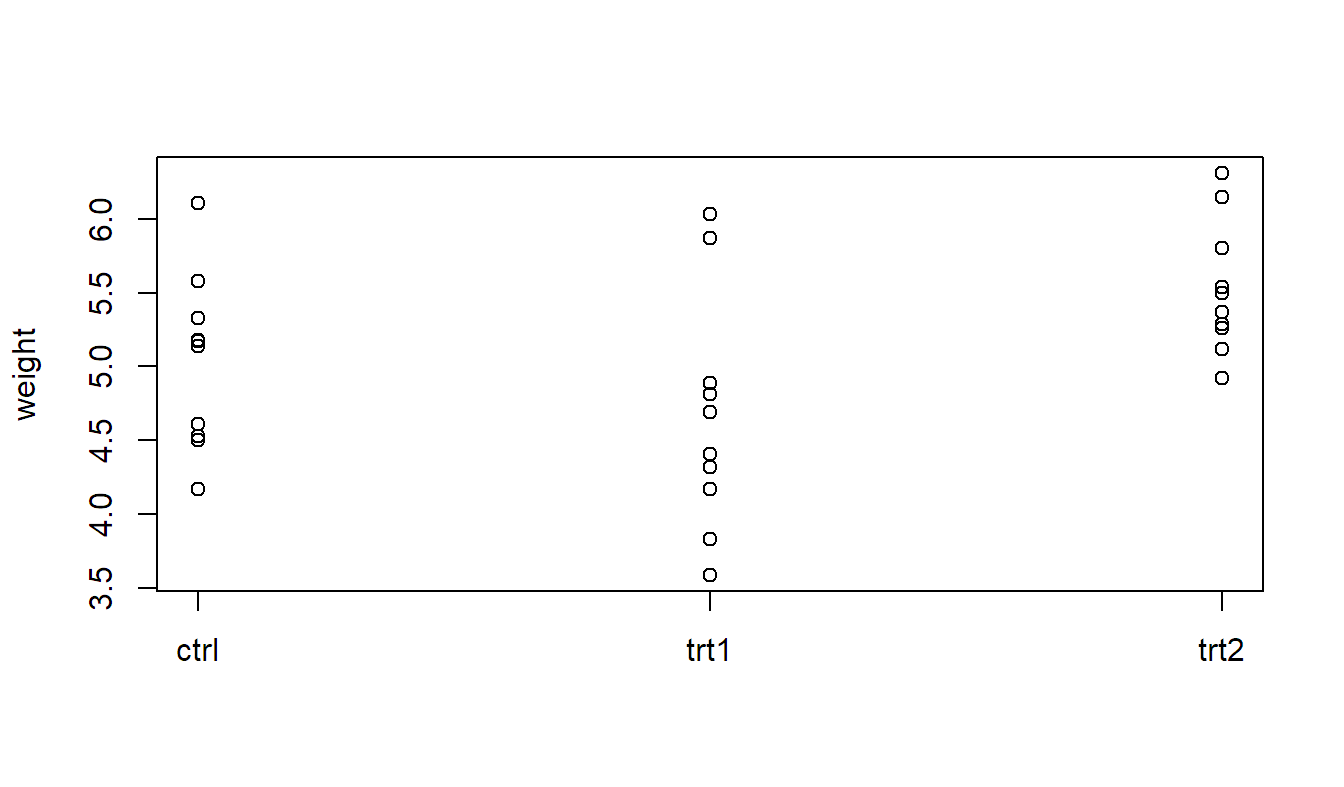
boxplot(weight ~ group, data = PlantGrowth)
We now fit the model (2.4) using the function aov
(which stands for analysis of variance). We state the model using the formula
notation where the response is listed on the left-hand side and the only
predictor is on the right-hand side of the tilde sign “~”. The estimated
parameters can be extracted using the function coef.
fit.plant <- aov(weight ~ group, data = PlantGrowth)
## Have a look at the estimated coefficients
coef(fit.plant)
## (Intercept) grouptrt1 grouptrt2
## 5.032 -0.371 0.494The element labelled (Intercept) contains \(\widehat{\mu} = 5.032\) which is the estimated expected value of the response of
the reference group ctrl, because, by default, we use contr.treatment and
the first level is the reference group; you can check the settings with the
command options("contrasts"). The next element grouptrt1 is
\(\widehat{\alpha}_2 = -0.371\). This means that the (expected)
difference of group trt1 to group ctrl is estimated to be
\(-0.371\). The last element grouptrt2 is
\(\widehat{\alpha}_3 = 0.494\). It is the difference of group trt2
to the group ctrl.
Hence, for all levels except the reference level, we see differences to the
reference group, while the estimate of the reference level can be found under
(Intercept).
We get a clearer picture by using the function dummy.coef which lists
the “full coefficients”.
dummy.coef(fit.plant)## Full coefficients are
##
## (Intercept): 5.032
## group: ctrl trt1 trt2
## 0.000 -0.371 0.494Interpretation is as in parametrization (2.3).
(Intercept) corresponds to \(\widehat{\mu}\) and
\(\widehat{\alpha}_1, \widehat{\alpha}_2\) and \(\widehat{\alpha}_3\) can be found under
ctrl, trt1 and trt2, respectively. For example,
for \(\widehat{\mu}_2\) we have \(\widehat{\mu}_2 = 5.032 - 0.371 = 4.661\).
The estimated cell means \(\widehat{\mu}_i\), which
we also call the predicted values per treatment group or simply the fitted
values, can also be obtained using the function predict on the object
fit.plant (which contains all information about the estimated model).
predict(fit.plant,
        newdata = data.frame(group = c("ctrl", "trt1", "trt2")))
## 1 2 3
## 5.032 4.661 5.526Alternatively, we can use the package emmeans (Lenth 2020), which stands
for estimated marginal means. In the argument specs we specify that we want
the estimated expected value for each level of group.
##  group emmean    SE df lower.CL upper.CL
##  ctrl    5.03 0.197 27     4.63     5.44
##  trt1    4.66 0.197 27     4.26     5.07
##  trt2    5.53 0.197 27     5.12     5.93
##
## Confidence level used: 0.95
Besides the estimated cell means in column emmean, we also get the corresponding
95% confidence intervals defined through columns lower.CL and upper.CL.
What happens if we change the side constraint to sum-to-zero? In R, this is
called contr.sum. We use the function options to change the encoding on a
global level, i.e., all subsequently fitted models will be affected by the new
encoding. Note that the corresponding argument contrasts takes two
values: The first one is for unordered factors and the second one is for ordered
factors (we leave the second argument at its default value contr.poly for the
moment).
options(contrasts = c("contr.sum", "contr.poly"))
fit.plant2 <- aov(weight ~ group, data = PlantGrowth)
coef(fit.plant2)
## (Intercept) group1 group2
## 5.073 -0.041 -0.412We get different values because the meaning of the parameters has changed. If we
closely inspect the output, we also see that a slightly different naming scheme
is being used. Instead of “factor name” and “level name” (e.g., grouptrt1) we
see “factor name” and “level number” (e.g., group2). The element (Intercept)
is now the global mean of the data, because the design is balanced, the
sum-to-zero constraint is the same as the weighted sum-to-zero constraint,
group1 is the difference of the first group (ctrl) to the global mean,
group2 is the difference of the second group (trt1) to the global mean. The
difference of trt2 to the global mean is not shown. Because of the
side constraint we know it must be \(-(-0.041-0.412) = 0.453\). Again, we get the
full picture by calling dummy.coef.
dummy.coef(fit.plant2)## Full coefficients are
##
## (Intercept): 5.073
## group: ctrl trt1 trt2
## -0.041 -0.412 0.453As before, we can get the estimated cell means with predict (alternatively, we
could of course again use emmeans).
predict(fit.plant2,
        newdata = data.frame(group = c("ctrl", "trt1", "trt2")))
## 1 2 3
## 5.032 4.661 5.526Note that the output of predict has not changed. The estimated cell means do
not depend on the side constraint that we employ. But the side constraint has
a large impact on the meaning of the parameters \(\widehat{\alpha}_i\) of the
model. If we do not know the side constraint, we do not know what the
\(\widehat{\alpha}_i\)’s actually mean!
2.1.3 Tests
With a two-sample \(t\)-test, we could test whether two samples share the same mean. We will now extend this to the \(g > 2\) situation. Saying that all groups share the same mean is equivalent to model the data as \[ Y_{ij} = \mu + \epsilon_{ij}, \, \epsilon_{ij} \,\, \mathrm{i.i.d.} \, \sim N(0, \sigma^2). \] This is the so-called single mean model. It is actually a special case of the cell means model where \(\mu_1 = \ldots = \mu_g\) which is equivalent to \(\alpha_1 = \ldots = \alpha_g = 0\) (no matter what side constraint we use for the \(\alpha_i\)’s).
Hence, our question boils down to comparing two models, the single mean and the cell means model, which is more complex. More formally, we have the global null hypothesis \[ H_0: \mu_1 = \mu_2 = \ldots = \mu_g \] vs. the alternative \[ H_A: \mu_k \neq \mu_l \textrm{ for at least one pair } k \neq l. \] We call it a global null hypothesis because it affects all parameters at the same time.
We will construct a statistical test by decomposing the variation of the response. The basic idea will be to check whether the variation between the different treatment groups (the “signal”) is substantially larger than the variation within the groups (the “noise”).
More precisely, total variation of the response around the overall mean can be decomposed into variation “between groups” and variation “within groups”, i.e., \[\begin{equation} \underbrace{\sum_{i=1}^g \sum_{j=1}^{n_i}(y_{ij} - \overline{y}_{\cdot\cdot})^2}_{SS_T} = \underbrace{\sum_{i=1}^g \sum_{j=1}^{n_i}(\overline{y}_{i\cdot} - \overline{y}_{\cdot\cdot})^2}_{SS_\mathrm{Trt}} + \underbrace{\sum_{i=1}^g \sum_{j=1}^{n_i}(y_{ij} - \overline{y}_{i\cdot})^2}_{SS_E}, \tag{2.5} \end{equation}\] where \[\begin{align*} SS_T & = \textrm{total sum of squares}\\ SS_\mathrm{Trt} & = \textrm{treatment sum of squares (between groups)}\\ SS_E & = \textrm{error sum of squares (within groups)} \end{align*}\] Hence, we have \[ SS_T = SS_\mathrm{Trt} + SS_E. \] As can be seen from the decomposition in Equation (2.5), \(SS_\mathrm{Trt}\) can also be interpreted as the reduction in residual sum of squares when comparing the cell means with the single mean model; this will be a useful interpretation later.
All this information can be summarized in a so-called ANOVA table, where ANOVA stands for analysis of variance, see Table 2.2.
| Source | df | Sum of Squares | Mean Squares | \(F\)-ratio |
|---|---|---|---|---|
| Treatment | \(g - 1\) | \(SS_\mathrm{Trt}\) | \(MS_\mathrm{Trt} = \frac{SS_\mathrm{Trt}}{g-1}\) | \(\frac{MS_\mathrm{Trt}}{MS_E}\) |
| Error | \(N - g\) | \(SS_E\) | \(MS_E = \frac{SS_E}{N-g}\) |
The mean squares (\(MS\)) are sum of squares (\(SS\)) that are normalized with the corresponding degrees of freedom. This is a so-called one-way analysis of variance, or one-way ANOVA, because there is only one factor involved. The corresponding cell means model is also called one-way ANOVA model.
Another rule of thumb for getting the degrees of freedom for the error is as follows: Total sum of squares has \(N - 1\) degrees of freedom (we have \(N\) observations that fluctuate around the global mean), \(g - 1\) degrees of freedom are “used” for the treatment effect (\(g\) groups minus one side constraint). Hence, the remaining part (the error) has \(N - 1 - (g - 1) = N - g\) degrees of freedom, or as before, “total number of observations minus number of groups”. A classical rule of thumb is that the error degrees of freedom should be at least 10; otherwise, the experiment has typically low power, because there are too many parameters in the model compared to the number of observations.
If all groups share the same expected value, the treatment sum of squares is typically small. Just due to the random nature of the response, small differences arise between the different (empirical) group means. The idea is now to compare this variation between groups with the variation within groups. If the variation between groups is substantially larger than the variation within groups, we have evidence against the null hypothesis.
In fact, it can be shown that under \(H_0\) (single mean model) it holds that \[ F\textrm{-ratio} = \frac{MS_{\mathrm{Trt}}}{MS_E} \sim F_{g-1, \, N-g} \] where we denote by \(F_{n, \, m}\) the so-called \(F\)-distribution with \(n\) and \(m\) degrees of freedom.
The \(F\)-distribution has two degrees of freedom parameters, one from the numerator, here, \(g - 1\), and one from the denominator, here, \(N - g\). See Figure 2.1 for the density of the \(F\)-distribution for some combinations of \(n\) and \(m\). Increasing the denominator degrees of freedom (\(m\)) shifts the mass in the tail (the probability for very large values) toward zero. The \(F_{1, \, m}\)-distribution is a special case that we already know; it is the square of a \(t_m\)-distribution, a \(t\)-distribution with \(m\) degrees of freedom.
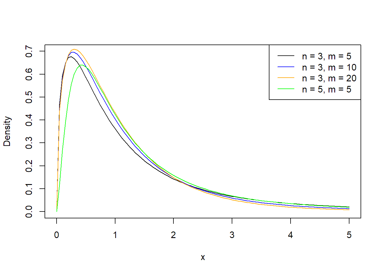
FIGURE 2.1: Densities of \(F\)-distributions.
As with any other statistical test, we reject the null hypothesis if the observed value of the \(F\)-ratio, our test statistics, lies in an “extreme” region of the corresponding \(F\)-distribution. Any deviation from \(H_0\) will lead to a larger value of the treatment sum of squares (between groups) and to a larger \(F\)-ratio. Hence, unusually large values of the \(F\)-ratio provide evidence against \(H_0\). Therefore, this is a one-sided test, which means that we reject \(H_0\) in favor of \(H_A\) if the \(F\)-ratio is larger than the 95%-quantile of the corresponding \(F_{g - 1, \, N-g}\)-distribution (if we use a significance level of 5%). We also use the notation \(F_{n, \, m, \, \alpha}\) for the \((\alpha \times 100)\)%-quantile of the \(F_{n, \, m}\)-distribution. Hence, we reject \(H_0\) in favor of \(H_A\) if \[ F\textrm{-ratio} \geq F_{g - 1, \, N - g, \, 1 - \alpha} \] if we use the significance level \(\alpha\), e.g., \(\alpha = 0.05\). Alternatively, we can directly have a look at the p-value, typically automatically reported by software, and reject \(H_0\) if the p-value is smaller than the chosen significance level. See Figure 2.2 for an illustration of the p-value for a situation where we have a realized \(F\)-ratio of 2.5. The p-value is simply the area under the curve for all values larger than 2.5 of the corresponding \(F\)-distribution.
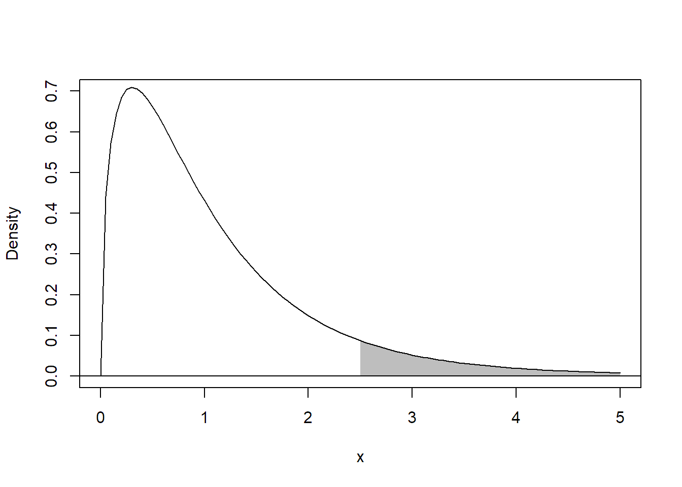
FIGURE 2.2: Illustration of the p-value (shaded area) for a realized \(F\)-ratio of 2.5.
As the test is based on the \(F\)-distribution, we simply call it an F-test. It is also called an omnibus test (Latin for “for all”) or a global test, as it compares all group means simultaneously.
Note that the result of the \(F\)-test is independent of the side constraint that we use for the \(\alpha_i\)’s, as it only depends on the group means.
In R, we can use the summary function to get the ANOVA table and the
p-value of the \(F\)-test.
summary(fit.plant)## Df Sum Sq Mean Sq F value Pr(>F)
## group 2 3.77 1.883 4.85 0.016
## Residuals 27 10.49 0.389In the column labelled Pr(>F) we see the corresponding p-value:
0.016. Hence, we reject the
null hypothesis on a 5% significance level.
Alternatively, we can also use the command drop1 to perform the \(F\)-test. From
a technical point of view, drop1 tests whether all coefficients related to a
“term” (here, a factor) are zero, which is equivalent to what we do with an
\(F\)-test.
drop1(fit.plant, test = "F")## Single term deletions
##
## Model:
## weight ~ group
## Df Sum of Sq RSS AIC F value Pr(>F)
## <none> 10.5 -25.5
## group 2 3.77 14.3 -20.3 4.85 0.016We get of course the same p-value as above, but drop1 will be a useful
function later (see Section 4.2.5).
As the \(F\)-test can also be interpreted as a test for comparing two
different models, namely the cell means and the single means model, we
have yet another approach in R. We can use the function anova to
compare the two models.
## Fit single mean model (1 means global mean, i.e., intercept)
fit.plant.single <- aov(weight ~ 1, data = PlantGrowth)
## Compare with cell means model
anova(fit.plant.single, fit.plant)
## Analysis of Variance Table
##
## Model 1: weight ~ 1
## Model 2: weight ~ group
## Res.Df RSS Df Sum of Sq F Pr(>F)
## 1 29 14.3
## 2 27 10.5 2 3.77 4.85 0.016Again, we get the same p-value. We would also get the same p-value if we would
use another side constraint, e.g., if we would use the fit.plant2 object. If
we use anova with only one argument, e.g., anova(fit.plant), we get the
same output as with summary.
To perform statistical inference for the individual \(\alpha_i\)’s we
can use the commands summary.lm for tests and confint for confidence
intervals.
summary.lm(fit.plant)## ...
## Coefficients:
## Estimate Std. Error t value Pr(>|t|)
## (Intercept) 5.032 0.197 25.53 <2e-16
## grouptrt1 -0.371 0.279 -1.33 0.194
## grouptrt2 0.494 0.279 1.77 0.088
## ...
confint(fit.plant)## 2.5 % 97.5 %
## (Intercept) 4.62753 5.436
## grouptrt1 -0.94301 0.201
## grouptrt2 -0.07801 1.066Now, interpretation of the output highly depends on the side constraint that is
being used. For example, the confidence interval
\([-0.943, 0.201]\) from the
above output is a confidence interval for the difference between trt1 and
ctrl (because we used contr.treatment). Again, if we do not know the
side constraint, we do not know what the estimates of the \(\alpha_i\)’s actually
mean. If unsure, you can get the current setting with the command
options("contrasts").
2.2 Checking Model Assumptions
Statistical inference (p-values, confidence intervals, etc.) is only valid if the model assumptions are fulfilled. So far, this means:
- The errors are independent
- The errors are normally distributed
- The error variance is constant
- The errors have mean zero
The independence assumption is most crucial, but also most difficult to check. The randomization of experimental units to the different treatments is an important prerequisite (Montgomery 2019; J. Lawson 2014). If the independence assumption is violated, statistical inference can be very inaccurate. If the design contains some serial or spatial structure, some checks can be done as outlined below for the serial case.
In the ANOVA setting, the last assumption is typically not as important as in a regression setting. The reason is that we are typically fitting models that are “complex enough,” and therefore do not show a lack of fit; see also the discussion in the following Section 2.2.1.
2.2.1 Residual Analysis
We cannot observe the errors \(\epsilon_{ij}\) but we have the residuals \(r_{ij}\) as “estimates.” Let us recall: \[ r_{ij} = y_{ij} - \widehat{\mu}_{i}. \] We now introduce different plots to check these assumptions. This means that we use graphical tools to perform qualitative checks.
Remark: Conceptually, one could also use statistical tests to perform these tasks. We prefer not to use them. Typically, these tests are again sensitive to model assumptions, e.g., tests for constant variance rely on the normal assumption. Or according to G. E. P. Box (1953),
To make the preliminary test on variances is rather like putting to sea in a rowing boat to find out whether conditions are sufficiently calm for an ocean liner to leave port!
In addition, as with any other statistical test, power increases with sample size. Hence, for large samples we get small p-values even for very small deviations from the model assumptions. Even worse, such a p-value does not tell us where the actual problem is, how severe it is for the statistical inference and what could be done to fix it.
We begin with a plot to check the normality assumption of the error term.
QQ-Plot
In a QQ-plot we plot the empirical quantiles of the residuals
or “what we see in the data” vs. the theoretical quantiles or “what we expect from
the model”. By default, a standard normal distribution is the theoretical
“reference distribution” (in such a situation, we also call it a normal plot).
The plot should show a more or less straight line if the normality assumption is
correct. In R, we can get it with the function qqnorm or by calling plot
on the fitted model and setting which = 2, because in R, it is the second
diagnostic plot.
plot(fit.plant, which = 2)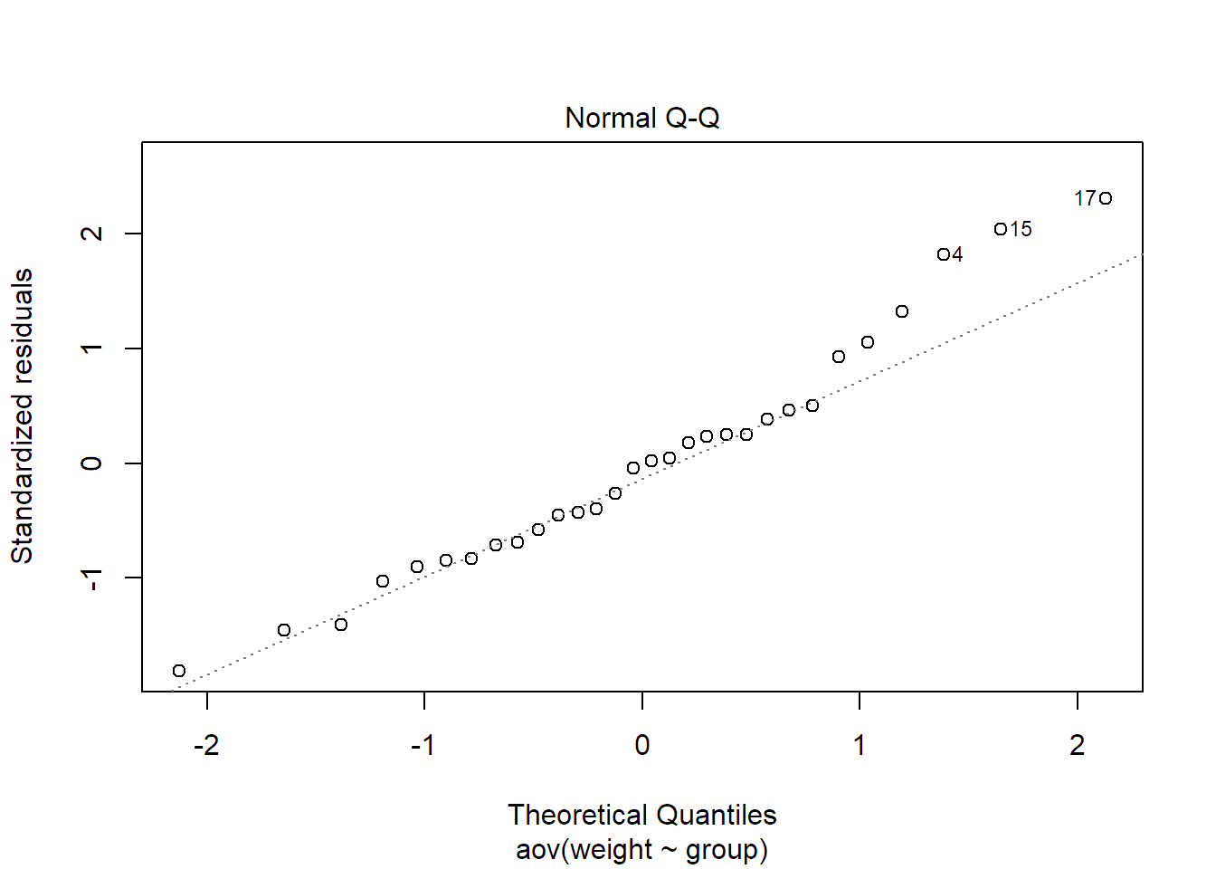
The plot for our data looks OK. As it might be difficult to judge what deviation
of a straight line can still be tolerated, there are alternative implementations
which also plot a corresponding “envelope” which should give you an idea of the
natural variation. One approach is implemented in the function qqPlot of
the package car (Fox and Weisberg 2019):

If the QQ-plot suggests non-normality, we can try to use a transformation of the response to accommodate this problem. Some situations can be found in Figure 2.3. For a response which only takes positive values, we can for example use the logarithm, the square root (or any power less than one) if the residuals are skewed to the right (Figure 2.3 middle). If the residuals are skewed to the left (Figure 2.3 left), we could try a power greater than one. More difficult is the situation where the residuals have a symmetric distribution but with heavier tails than the normal distribution (Figure 2.3 right). An approach could be to use methods that are presented in Section 2.3. There is also the option to consider a whole family of transformations, the so-called Box-Cox transformation, and to choose the best fitting one, see G. E. P. Box and Cox (1964).
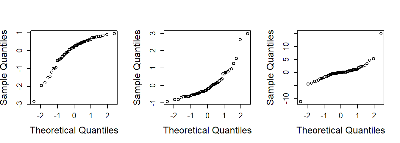
FIGURE 2.3: Examples of QQ-plots with deviations from normality. Left: Distribution is skewed to the left. Middle: Distribution is skewed to the right. Right: Distribution has heavier tails than the normal distribution.
A transformation can be performed directly in the function call of aov. While
a generic call aov(y ~ treatment, data = data) would fit a one-way ANOVA model
with response y and predictor treatment on the original scale of the
response, we get with aov(log(y) ~ treatment, data = data) the one-way ANOVA
model where we take the natural logarithm of the response. Of course you can
also add a transformed variable yourself to the data-frame and use this variable
in the model formula.
Note that whenever we transform the response, this comes at the price of a new interpretation of the parameters! Care has to be taken if one wants to interpret statistical inference (e.g., confidence intervals) on the original scale as many aspects unfortunately do not easily “transform back”! See Section 2.2.2 for more details.
Tukey-Anscombe Plot
The Tukey-Anscombe plot (TA-plot) plots the
residuals \(r_{ij}\) vs. the fitted values \(\widehat{\mu}_{i}\) (estimated
cell means). It allows us to check whether the residuals have constant variance.
In addition, we could check whether there are regions where the model does not
fit the data well such that the residuals do not have mean zero. However, this
is not relevant yet as outlined below. In R, we can again use the function
plot. Now we use the argument which = 1.
plot(fit.plant, which = 1)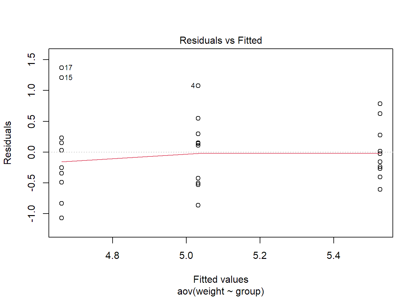
The solid line is a smoother (a local average) of the residuals. We could get rid
of it by using the function call plot(fit.plant, which = 1, add.smooth = FALSE). For
the one-way ANOVA situation, we could of course also read off the same
information from the plot of the data itself. In addition, as we model one
expected value per group, the model is “saturated,” meaning it is the most
complex model we can fit to the data, and the residuals automatically always
have mean zero per group. The TA-plot will therefore be more useful later if
we have more than one factor, see Chapter 4.
If you know this plot already from the regression setup and are worried about the vertical stripes, they are completely natural. The reason is that we only have \(g = 3\) estimated cell means (\(\widehat{\mu}_i\)’s) here on the \(x\)-axis.
In practice, a very common situation is that variation of a (positive) response is rather multiplicative (like \(\pm 5\%\)) than additive (like \(\pm \textrm{constant value}\)), especially for situations where the response spreads over several orders of magnitude. The TA-plot then shows a linear increase of the standard deviation of the residuals (spread in the \(y\)-direction) with respect to the mean (on the \(x\)-axis), i.e., we have a “funnel shape” as in Figure 2.4 (left). Again, we can transform the response to fix this problem. For a situation like this, the logarithm will be the right choice, as can be seen in Figure 2.4 (right).
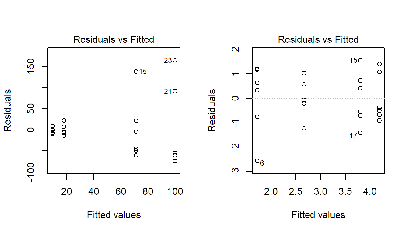
FIGURE 2.4: Tukey-Anscombe plot for the model using the original response (left) and for the model using the log-transformed response (right). Original data not shown.
The general rule is that if the standard deviation of the residuals is a
monotone function of the fitted values (cell means), this can typically be fixed
by a transformation of the response (as just seen with the logarithm). If the
variance does not follow such a pattern, weights can be introduced to
incorporate this so-called heteroscedasticity. The corresponding argument in the
function aov is weights. However, we will not discuss this further here.
Index Plot
If the data has some serial structure, i.e., if observations were recorded in a certain time order, we typically want to check whether residuals close in time are more similar than residuals far apart, as this would be a violation of the independence assumption. We can do so by using a so-called index plot where we plot the residuals against time. For positively dependent residuals, we would see time periods where most residuals have the same sign, while for negatively dependent residuals, the residuals would “jump” too often from positive to negative compared to independent residuals. Examples can be found in Figure 2.5. Of course we could start analyzing these residuals with methodology from time-series analysis. Similar problems arise if the experimental design has a spatial structure. Then we could start analyzing the residuals using approaches known from spatial statistics.
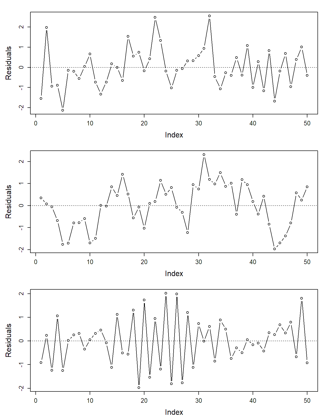
FIGURE 2.5: Examples of index plots: independent (top), positively correlated (middle) and negatively correlated residuals (bottom).
2.2.2 Transformations Affect Interpretation
Whenever we transform the response, we implicitly also change the interpretation of the model parameters. Therefore, while it is conceptually attractive to model the problem on an appropriate scale of the response, this typically has the side effect of making interpretation potentially much more difficult.
Consider an example where we have a positive response. We transform it using
the logarithm and use the standard model on the log-scale, i.e.,
\[\begin{equation}
\log(Y_{ij}) = \mu + \alpha_i + \epsilon_{ij}.
\tag{2.6}
\end{equation}\]
All the \(\alpha_i\)’s and their estimates have to be interpreted on the
log-scale. Say we use the reference group encoding scheme (contr.treatment)
where the first group is the reference group and we have \(\widehat{\alpha}_2 = 1.5\). This means that on the log-scale we estimate that the average value of group 2
is \(1.5\) larger than the average value of group 1 (additive shift). What about
the effect on the original scale? On the log-scale we had \(E[\log(Y_{ij})] = \mu + \alpha_{i}\). What does this tell us about \(E[Y_{ij}]\), the expected value
on the original scale? In general, the expected value does not directly
follow a transformation. Here, if we back-transform with the exponential function,
this means
\[
E[Y_{ij}] \neq e^{\mu + \alpha_{i}}.
\]
Actually, we can calculate \(E[Y_{ij}]\) here if we assume a normal distribution
for the error term, but let us first have a look at what can be done in a more
general situation.
We can easily make a statement about the median. On the transformed scale (here, log-scale), the median is equal to the mean, assuming we have a symmetric distribution for the error term, as is the case for the normal distribution. Hence, \[ \mathrm{median}(\log(Y_{ij})) = \mu + \alpha_i. \] In contrast to the mean, any quantile directly transforms with a strictly monotone increasing function. As the median is nothing more than the 50% quantile, we have (on the original scale) \[ \mathrm{median}(Y_{ij}) = e^{\mu + \alpha_i}. \] Hence, we can estimate \(\mathrm{median}(Y_{ij})\) with \(e^{\widehat{\mu} + \widehat{\alpha}_i}\). If we also have a confidence interval for \(\mu_i = \mu + \alpha_i\), we can simply apply the exponential function to the ends and get a confidence interval for \(\mathrm{median}(Y_{ij})\) on the original scale. This way of thinking is valid for any strictly monotone transformation function.
Here, we can in addition easily calculate the ratio (because of the properties of the exponential function) \[ \frac{\mathrm{median}(Y_{2j})}{\mathrm{median}(Y_{1j})} = \frac{e^{\mu + \alpha_2}}{e^{\mu}} = e^{\alpha_2}. \] Therefore, we can make a statement that on the original scale the median of group 2 is \(e^{\widehat{\alpha}_2} = e^{1.5} = 4.48\) as large as the median of group 1. This means that additive effects on the log-scale become multiplicative effects on the original scale. If we also consider a confidence interval for \(\alpha_2\), say \([1.2, 1.8]\), the transformed version \([e^{1.2}, e^{1.8}]\) is a confidence interval for \(e^{\alpha_2}\) which is the ratio of medians on the original scale, that is for (see above) \[ \frac{\mathrm{median}(Y_{2j})}{\mathrm{median}(Y_{1j})}. \] Statements about the median on the original scale are typically very useful, as the distribution is skewed on the original scale. Hence, the median is a better, more interpretable, summary than the mean.
What can we do if we are still interested in the mean? If we use the standard assumption of normal errors with variance \(\sigma^2\) in Equation (2.6), one can show that \[ E[Y_{ij}] = e^{\mu + \alpha_i + \sigma^2/2}. \] Getting a confidence interval directly for \(E[Y_{ij}]\) would need more work. However, if we consider the ratio of group 2 and group 1 (still using the reference group encoding scheme), we have \[ \frac{E[Y_{2j}]}{E[Y_{1j}]} = \frac{e^{\mu + \alpha_2 + \sigma^2/2}}{e^{\mu + \sigma^2/2}} = e^{\alpha_2}. \] This is the very same result as above. Hence, the transformed confidence interval \([e^{1.2}, e^{1.8}]\) is also a confidence interval for the ratio of the mean values on the original scale! This “universal” quantification of the treatment effect on the original scale is a special feature of the log-transformation (because differences on the transformed scale are ratios on the original scale). When considering other transformation, this nice property is typically not available anymore. This makes interpretation much more difficult.
2.2.3 Checking the Experimental Design and Reports
When analyzing someone else’s data or when reading a research paper, it is always a good idea to critically think about how the experiment was set up and how the statements in the research paper have to be understood:
- Is the data coming from an experiment or is it observational data? What claims are being made (causation or association)?
- In case of an experimental study: Was randomization used to assign the experimental units to the treatments? Might there be confounding variables which would weaken the results of the analysis?
- What is the experimental unit? Remember: When the treatment is allocated and administered to, e.g., feeders which are used by multiple animals, an experimental unit is given by a feeder and not by an individual animal. An animal would be an observational unit in this case. The average value across all animals of the same feeder would be what we would use as \(Y_{ij}\) in the one-way ANOVA model in Equation (2.4).
- When the estimated coefficients of treatment effects (the \(\widehat{\alpha}_i\)’s) are being discussed: Is it clear what the corresponding side constraint is?
- If the response was transformed: Are the effects transformed appropriately?
- Was a residual analysis performed?
2.3 Nonparametric Approaches
What can we do if the distributional assumptions cannot be fulfilled? In the
same way that there is a nonparametric alternative for the two-sample \(t\)-test
(the so-called Mann-Whitney test, implemented in function wilcox.test), there
is a non-parametric alternative for the one-way ANOVA setup: the
Kruskal-Wallis test. The assumption of the
Kruskal-Wallis test is that under \(H_0\), all groups share the same distribution
(not necessarily normal) and under \(H_A\), at least one group has a shifted
distribution (only location shift; the shape has to be the same). Instead of
directly using the response, the Kruskal-Wallis test uses the corresponding
ranks (we omit the details here). The test is available in the function
kruskal.test, which can basically be called in the same way as aov:
fit.plant.kw <- kruskal.test(weight ~ group, data = PlantGrowth)
fit.plant.kw
##
## Kruskal-Wallis rank sum test
##
## data: weight by group
## Kruskal-Wallis chi-squared = 8, df = 2, p-value = 0.02On this data set, the result is very similar to the parametric approach of
aov. Note, however, that we only get the p-value of the global test and cannot
do inference for individual treatment effects as was the case with aov.
A more general approach is using randomization tests where we would reshuffle the treatment assignment on the given data set to derive the distribution of some test statistics under the null hypothesis from the data itself. See for example Edgington and Onghena (2007) for an overview.
2.4 Power or “What Sample Size Do I Need?”
2.4.1 Introduction
By construction, a statistical test controls the so-called type I error rate with the significance level \(\alpha\). This means that the probability that we falsely reject the null hypothesis \(H_0\) is less than or equal to \(\alpha\). Besides the type I error, there is also a type II error. It occurs if we fail to reject the null hypothesis even though the alternative hypothesis \(H_A\) holds. The probability of a type II error is typically denoted by \(\beta\) (and we are not controlling it). Note that there is no “universal” \(\beta\), it actually depends on the specific alternative \(H_A\) that we believe in, i.e., assume. There is no such thing as “the” alternative \(H_A\), we have to make a decision here.
The power of a statistical test, for a certain parameter setting under the alternative, is defined as \[ P(\textrm{reject $H_0$ given that a certain setting under $H_A$ holds}) = 1 - \beta. \] It translates as “what is the probability to get a significant result, assuming a certain parameter setting under the alternative \(H_A\) holds”. Intuitively, it seems clear that the “further away” we choose the parameter setting from \(H_0\), the larger will be the power, or the smaller will be the probability of a type II error.
Calculating power is like a “thought experiment.” We do not need data but a precise specification of the parameter setting under the alternative that we believe in (“what would happen if …?”). This does not only include the parameters of interest but also nuisance parameters like the error variance \(\sigma^2\).
2.4.2 Calculating Power for a Certain Design
Why should we be interested in such an abstract concept when planning an experiment? Power can be thought of as the probability of “success,” i.e., getting a significant result. If we plan an experiment with low power, it means that we waste time and money because with high probability we are not getting a significant result. A rule of thumb is that power should be larger than 80%.
A typical question is: “What sample size do I need for my experiment?”. There is of course no universal answer, but rather: “It depends on what power you like.” So what does power actually depend on? It depends on
- design of the experiment (balanced, unbalanced, without blocking, with blocking, etc.)
- significance level \(\alpha\)
- parameter setting under the alternative (incl. error variance \(\sigma^2\))
- sample size \(n\)
We can mainly maximize power using the first and the last item from above.
Remark: In the same spirit, we could also ask ourselves how precise our parameter estimates will be. This is typically answered by checking if the widths of the corresponding confidence intervals (depending on the same quantities as above) are narrow enough.
For “easy” designs like a balanced completely randomized design, there are formulas to calculate power. They depend on the so-called non-central \(F\)-distribution which includes a non-centrality parameter (basically measuring how far away a parameter setting is from the null hypothesis of no treatment effect). We will not do these details here. As soon as the design is getting more complex as in the following chapters, things are typically much more complicated. Luckily, there is a simple way out. What we can always do is to simulate a lot of data sets under the alternative that we believe in and check how often we are rejecting the corresponding null hypothesis. The empirical rejection rate is then an estimate of the power; we can always increase the precision of this estimate by increasing the number of simulation runs.
We have a look at both approaches using a one-way ANOVA model with five groups (that is, we have \(\mu_1, \mu_2, \ldots, \mu_5\)) using a balanced design. The null hypothesis is \[ H_0: \mu_1 = \ldots = \mu_5 \] while the alternative hypothesis is \[ H_A: \mu_k \neq \mu_l \textrm{ for at least one pair } k \neq l. \] For example, we could assume that under \(H_A\) we have \[ \mu_1 = 57, \, \mu_2 = 63, \, \mu_3 = 60, \, \mu_4 = 60, \, \mu_5 = 60. \] In addition, we have to specify the error variance. We assume it to be \(\sigma^2 = 7\).
For such an easy design, we can use the function power.anova.test to
calculate the power. It needs the number of groups as input (here, 5),
the variance between the group means \(\mu_i\), the error variance
\(\sigma^2\) and the sample size within each group (assuming a balanced
design). By default it uses a 5% significance level. If we assume \(n = 4\)
observations in each group, we have the following function call.
mu     <- c(57, 63, rep(60, 3))
sigma2 <- 7
power.anova.test(groups = length(mu), n = 4, between.var = var(mu),
                 within.var = sigma2)
##
## Balanced one-way analysis of variance power calculation
##
## groups = 5
## n = 4
## between.var = 4.5
## within.var = 7
## sig.level = 0.05
## power = 0.578
##
## NOTE: n is number in each groupAccording to the output, power is 58%. This means that we have a 58% chance to get a significant result under the above settings.
We can also leave away the argument n and use the argument power to
get the required sample size (per group) for a certain power (here, 80%).
power.anova.test(groups = length(mu), between.var = var(mu),
                 within.var = sigma2, power = 0.8)
##
## Balanced one-way analysis of variance power calculation
##
## groups = 5
## n = 5.676
## between.var = 4.5
## within.var = 7
## sig.level = 0.05
## power = 0.8
##
## NOTE: n is number in each groupThis means that for achieving a power of more than 80%, we need six observations per group.
What happens if we are facing a situation where there is no dedicated function
like power.anova.test? We can easily calculate power using the simulation-based
approach described above. Based on our specific setting under the
alternative, we simulate many times a new data set, fit the one-way ANOVA
model and check whether the corresponding \(F\)-test is significant.
n.sim  <- 1000                  ## number of simulations
mu     <- c(57, 63, rep(60, 3)) ## group means
sigma2 <- 7                     ## error variance
n      <- 4                     ## number of observations per group

g     <- length(mu)
group <- factor(rep(LETTERS[1:g], each = n))

results <- numeric(n.sim) ## vector to store results in

for(i in 1:n.sim){
  ## Simulate new response, build data set
  y <- rnorm(n * g, mean = rep(mu, each = n), sd = sqrt(sigma2))
  data <- data.frame(y = y, group = group)

  ## Fit one-way ANOVA model
  fit  <- aov(y ~ group, data = data)

  ## Extract result of global F-test
  results[i] <- summary(fit)[[1]][1, "Pr(>F)"] < 0.05 ## 1 = reject
}

mean(results) ## proportion of simulation runs that rejected H_0
## [1] 0.599We get the result that in about 60% of the
simulation runs, we got a significant result. This is very close to the result
from above. If we wanted to increase the precision of our calculations, we could
easily do this by using a larger value for the number of simulation runs
n.sim.
A nice side effect of doing a power analysis is that you actually do the whole data analysis on simulated data and you immediately see whether this works as intended.
From a conceptual point of view, we can use such a simulation-based procedure for
any design. Some implementations can be found in package Superpower
(Lakens and Caldwell 2021) and simr (Green and MacLeod 2016). However, the number of parameters grows
rather quickly with increasing model complexity (see the following chapters) and
some of them are hard to specify in practice, e.g., the error variance, or the
variances of different random effects as we will learn about in Chapter
6. If we are lucky, we have data from a
pre-study. Unfortunately, the variance estimates are quite imprecise if we only
have very limited amount of data. We could then consider a conservative
estimate.
In that sense, the results of a power analysis are typically not very precise. However, they should still give us a rough idea about the required sample size in the sense of whether we need 6 or 60 observations per group.
In practice, resources (time, money, etc.) are limited. A power analysis still gives us an answer about whether it is actually worth doing the experimental study with the sample size that we can afford or whether it is a waste of resources (if the corresponding power is too low).
2.5 Adjusting for Covariates
Quite often, we do not only have the information about the treatment for each experimental unit, but also additional covariates (predictors), see also Section 1.2.1. Think for example of age, weight or some blood measurement when comparing the efficacy of drugs with patients. If these variables also have an influence on the response, we can get more precise, and less biased, estimates of the treatment effect when considering them. We have already seen this idea in Section 1.2.2 when discussing the basic idea of blocking. However, if we for example do not have the information about these covariates early enough, we cannot create blocks. Nevertheless, we can still incorporate the corresponding information in the analysis. This is also called an analysis of covariance (ANCOVA). From a technical point of view it is nothing more than a regression model (see also Section 2.6.2) with a categorical predictor, given by the treatment factor, and one (or multiple) typically continuous predictors.
Note that the additional covariates are not allowed to be affected by the treatment; otherwise, we have to be very careful of what the treatment effect actually means from a causal point of view. An example where this assumption is (trivially) fulfilled is the situation where the covariates are measured before the treatment is being applied.
Let us consider an example where we have a completely randomized design with a
response y, a treatment factor treatment (with levels drug.A, drug.B and
drug.C) and a continuous predictor x (e.g., think of some blood
measurement). Our main interest is in the global test of the treatment factor.
We first load the data, inspect it and do a scatter plot which reveals that the
covariate x is indeed predictive for the response y.
book.url <- "http://stat.ethz.ch/~meier/teaching/book-anova"
ancova <- read.table(file.path(book.url, "data/ancova.dat"),
                     header = TRUE, stringsAsFactors = TRUE)
str(ancova)
## 'data.frame': 60 obs. of 3 variables:
## $ treatment: Factor w/ 3 levels "drug.A","drug.B",..: 1 1 1 1 1 1 ...
## $ x : num 21 17.8 24.6 ...
## $ y : num 48.9 39.1 67.3 ...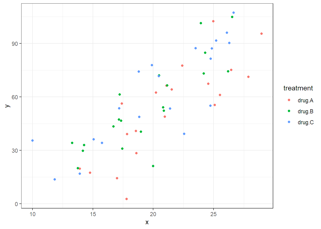
If we assume that the effect of the covariate is linear and the same for all treatment groups, we can extend the model in Equation (2.4) to include the covariate and get \[\begin{equation} Y_{ij} = \mu + \alpha_i + \beta \cdot x_{ij} + \epsilon_{ij} \tag{2.7} \end{equation}\] with \(\epsilon_{ij}\) i.i.d. \(\sim N(0,\sigma^2)\) and \(i = 1, 2, 3\), \(j = 1, \ldots, 20\). Note that \(x_{ij}\) is the value of the covariate of the \(j\)th experimental unit in treatment group \(i\) and \(\beta\) is the corresponding slope parameter. This means the model in Equation (2.7) fits three lines with different intercepts, given by \(\mu + \alpha_i\), and a common slope parameter \(\beta\), i.e., the lines are all parallel. This also means that the treatment effects (\(\alpha_i\)’s) are always the same. No matter what the value of the covariate, the difference between the treatment groups is always the same (given by the different intercepts). The fitted model is visualized in Figure 2.6.
How can we fit this model in R? We can still use the aov function, but we
have to adjust the model formula to y ~ treatment + x (we could also use the
lm function). We use the drop1 function to get the p-value for the global
test of treatment which is adjusted for the covariate x (this will be
discussed in more detail in Section 4.2.5).
options(contrasts = c("contr.treatment", "contr.poly"))
fit.ancova <- aov(y ~ treatment + x, data = ancova)
drop1(fit.ancova, test = "F")
## Single term deletions
##
## Model:
## y ~ treatment + x
## Df Sum of Sq RSS AIC F value Pr(>F)
## <none> 12337 328
## treatment 2 1953 14290 332 4.43 0.016
## x 1 27431 39768 396 124.51 7.4e-16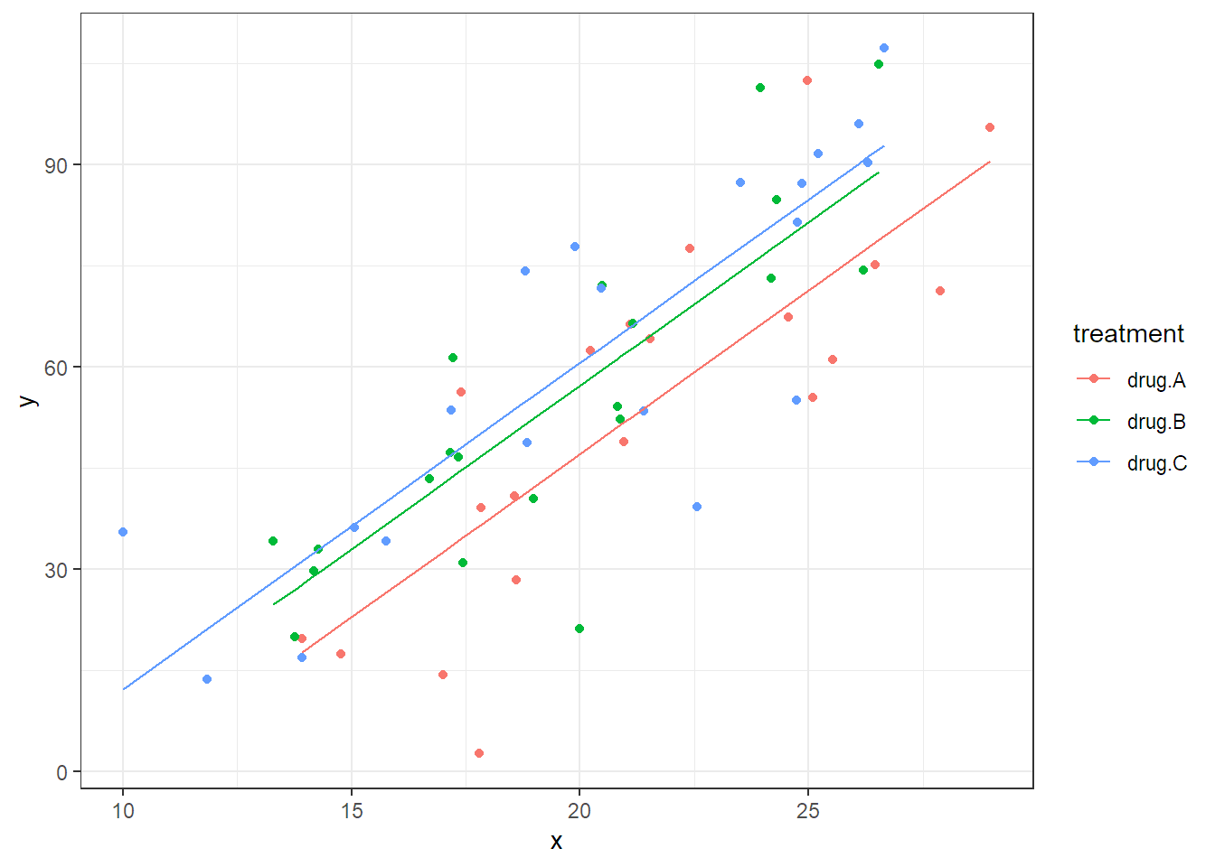
FIGURE 2.6: Scatter plot and illustration of the fitted model which includes the covariate x.
Note that we only lose one degree of freedom if we incorporate the covariate x
into the model because it only uses one parameter (slope \(\beta\)). The
treatment effect is significant. We cannot directly read off the estimate
\(\widehat{\beta}\) from the summary output, but we can get it when calling
coef (or dummy.coef).
coef(fit.ancova)## (Intercept) treatmentdrug.B treatmentdrug.C x
## -49.68 10.13 13.52 4.84The estimate of the slope parameter can be found under x, hence
\(\widehat{\beta} = 4.84\). However, note that the
focus is clearly on the test of treatment. The covariate x is just a “tool”
to get a more powerful test for treatment.
Doing an analysis without the covariate would not be wrong here, but less efficient and to some extent slightly biased (see also the discussion below about conditional bias). The one-way ANOVA model can be fitted as usual.
## Single term deletions
##
## Model:
## y ~ treatment
##           Df Sum of Sq   RSS AIC F value Pr(>F)
## <none>                 39768 396
## treatment  2      1002 40770 393    0.72   0.49
We observe that the p-value of treatment is much larger compared to the
previous analysis. The reason is that there is much more unexplained variation.
In the classical one-way ANOVA model (stored in object fit.ancova2), we have to
deal with the whole variation of the response. In Figure
2.6 this is the complete variation in the direction
of the \(y\)-axis (think of projecting all points on the \(y\)-axis). Alternatively,
we can also visualize this by individual boxplots.
boxplot(y ~ treatment, data = ancova)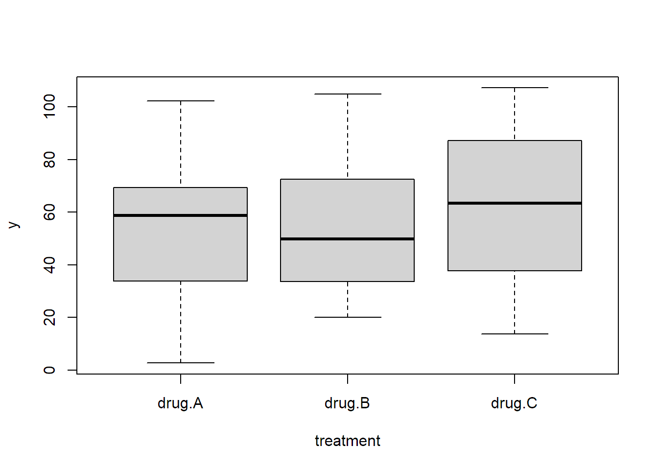
With the ANCOVA approach, we have the predictor x which explains, and therefore
removes, a lot of the variation and what is left for the error term is only the
variation around the straight lines in Figure 2.6.
Here are a few words about interpretation. The treatment effects that we estimate with
the ANCOVA model in Equation (2.7) are condititional
treatment effects (conditional on the same value of the covariate x). If we do
a completely randomized design and ignore the covariate by using “only” a one-way
ANOVA model, we get unbiased estimates of the treatment effect, in the sense
that if we repeat this procedure many times and take the sample mean of the
estimates, we get the true values. However, for a given realization, the usual
ANOVA estimate can be slightly biased because the covariate is not perfectly
balanced between the treatment groups. This is also called a conditional bias.
This bias is typically small for a completely randomized design. Hence,
in these situations, using the covariate is mainly due to efficiency gains, i.e.,
power. However, for observational data, the covariate imbalance can be
substantial, and using a model including the covariate is typically (desperately)
needed to reduce bias. See also the illustrations in section 6.4 of Huitema (2011).
This was of course only an easy example. It could very well be the case that the effect of the covariate is not the same for all treatment groups, leading to a so-called interaction between the treatment factor and the covariate, or that the effect of the covariate is not linear. These issues make the analysis more complex. For example, with different slopes there is no “universal” treatment effect anymore, but the difference between the treatment groups depends on the actual value of the covariate.
The idea of using additional covariates is very general and basically applicable to nearly all the models that we learn about in the following chapters.
2.6 Appendix
2.6.1 Ordered Factors: Polynomial Encoding Scheme
To illustrate the special aspects of an ordered factor, we consider the
following hypothetical example. The durability of a technical component
(variable durability taking values between 0 and 100) was tested for different
pressure levels applied in the production process (variable pressure measured
in bar). Note that the predictor pressure could also be interpreted as a
continuous variable here. If we treat it as a factor, we are in the situation to
have an ordered factor.
We first load the data and make sure that pressure is encoded as an ordered factor.
book.url <- "http://stat.ethz.ch/~meier/teaching/book-anova"
stress <- read.table(file.path(book.url, "data/stress.dat"),
                     header = TRUE)
stress[,"pressure"] <- ordered(stress[,"pressure"])
str(stress)
## 'data.frame': 16 obs. of 2 variables:
## $ pressure : Ord.factor w/ 4 levels "1"<"1.5"<"2"<..: 1 1 1 1 2 2 ...
## $ durability: int 54 58 65 58 77 67 ...A visualization of the data can be found in Figure 2.7
(R code not shown).
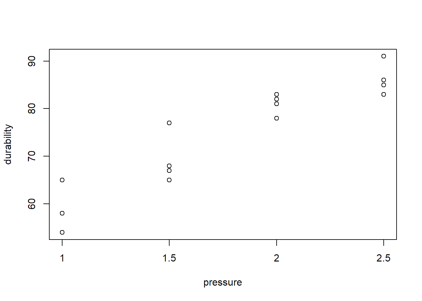
FIGURE 2.7: Visualization of durability vs. pressure.
Due to the ordered nature of pressure, it makes sense to also consider other
parametrizations than those presented in Table 2.1. The 4
different cell means uniquely define a polynomial of order 3
(because 2 points define a linear function, 3 points define a quadratic
function, 4 points define a polynomial of order 3). Hence, for the general
situation with \(g\) treatments, we can use a polynomial of order \(g - 1\) to
parametrize the \(g\) different cell means. Here, this means
\[\begin{equation}
\mu_i = \mu + \alpha_1 \cdot \textrm{pressure}_i + \alpha_2 \cdot \textrm{pressure}_i^2 + \alpha_3 \cdot \textrm{pressure}_i^3.
\tag{2.8}
\end{equation}\]
Think of simply plugging in the actual numerical value for \(\textrm{pressure}_i\)
in Equation (2.8).
How do we tell R to use such an approach? The second argument when calling
options(contrasts = c("contr.sum", "contr.poly")) is the parametrization for
ordered factors. The default value is "contr.poly" and
basically does what we described above. Unfortunately, the reality is a bit more
complicated because R internally uses the value 1 for the smallest level, 2
for the second smallest up to (here) 4 for the largest level (originally 2.5
bar). This means that such an approach only makes sense if the different values
of the predictor are equidistant, as they are in our example, or equidistant
after a transformation, for example, 1, 2, 4, 8 would be equidistant on the
log-scale; then everything what follows has to be understood as effects on the
log-scale of the predictor. In addition, so-called orthogonal polynomials are
being used which look a bit more complicated than what we had in Equation
(2.8).
The coefficients that we see later in the output (\(\widehat{\alpha}_1, \widehat{\alpha}_2\) and \(\widehat{\alpha}_3\), respectively) are indicators for
the linear, quadratic and cubic trend components of the treatment effect.
However, note that for example \(\widehat{\alpha}_1\) is typically not the
actual slope estimate because of the aforementioned internal rescaling of the
predictor in R.
If we fit a one-way ANOVA model to this data set, we use the same approach as always (remember: we now simply use another fancy parametrization for the cell means which does not affect the \(F\)-test).
##             Df Sum Sq Mean Sq F value  Pr(>F)
## pressure     3   1816     605      37 2.4e-06
## Residuals   12    196      16
The effect of pressure is highly significant. Now let us have a look at the
statistical inference for the individual \(\alpha_i\)’s.
summary.lm(fit.stress)## ...
## Coefficients:
## Estimate Std. Error t value Pr(>|t|)
## (Intercept) 73.81 1.01 73.01 < 2e-16
## pressure.L 21.07 2.02 10.42 2.3e-07
## pressure.Q -2.63 2.02 -1.30 0.22
## pressure.C -1.73 2.02 -0.86 0.41
## ...Now the coefficient names are different than what we used to get. The three rows
labelled with pressure.L, pressure.Q
and pressure.C are the
estimates of the linear, quadratic and cubic component, i.e., \(\widehat{\alpha}_1\),
\(\widehat{\alpha}_2\), \(\widehat{\alpha}_3\). We shouldn’t spend too much
attention on the actual estimates (column Estimate) because the value depends
on the internal parametrization. Luckily, the p-values still offer an easy
interpretation. For example, the null hypothesis of the row pressure.L
is: “the linear component of the relationship between durability and
pressure is zero,” or equivalently \(H_0: \alpha_1 = 0\).
From the output, we can conclude that only the linear part is significant with a
very small p-value. Hence, the conclusion would be that the data can be
described using a linear trend (which could also be used to interpolate between
the observed levels of pressure), and there is no evidence of a quadratic or
cubic component. In that sense, such an ANOVA model is very close to an approach
using a linear regression model where we would treat pressure as a continuous
predictor. See also Section 2.6.2 for more information
that ANOVA models are basically nothing more than special linear regression
models.
2.6.2 Connection to Regression
We can also write Equation (2.4) in matrix notation \[ Y = X \beta + E, \] where \(Y \in \mathbb{R}^N\) contains all the response values, \(X\) is an \(N \times g\) matrix, the so-called design matrix, \(\beta \in \mathbb{R}^g\) contains all parameters and \(E \in \mathbb{R}^N\) are the error terms. A row of the design matrix corresponds to an individual observation, while a column corresponds to a parameter. This is a typical setup for any regression problem.
We use a subset of the PlantGrowth data set (only the
first two observations per group) for illustration.
PlantGrowth[c(1, 2, 11, 12, 21, 22),]## weight group
## 1 4.17 ctrl
## 2 5.58 ctrl
## 11 4.81 trt1
## 12 4.17 trt1
## 21 6.31 trt2
## 22 5.12 trt2Hence, for the response we have the vector of observed values
\[ y = \left( \begin{array}{cc} 4.17 \\ 5.58 \\ 4.81 \\ 4.17 \\ 6.31 \\ 5.12 \end{array} \right). \]
How do the design matrix \(X\) and the parameter vector \(\beta\) look
like? This depends on the side constraint on the \(\alpha_i\)’s. If we use
contr.treatment, we get
\[\begin{equation*}
X = \left(
\begin{array}{ccc}
1 & 0 & 0 \\
1 & 0 & 0 \\
1 & 1 & 0 \\
1 & 1 & 0 \\
1 & 0 & 1 \\
1 & 0 & 1 \\
\end{array}
\right), \qquad \beta = \left(
\begin{array}{cc}
\mu \\
\alpha_2 \\
\alpha_3
\end{array}
\right)
\end{equation*}\]
because the group ctrl is the reference level (hence \(\alpha_1 = 0\)).
For contr.sum we have
\[\begin{equation*}
X = \left(
\begin{array}{rrr}
1 & 1 & 0 \\
1 & 1 & 0 \\
1 & 0 & 1 \\
1 & 0 & 1 \\
1 & -1 & -1 \\
1 & -1 & -1 \\
\end{array}
\right), \qquad \beta = \left(
\begin{array}{cc}
\mu \\
\alpha_1 \\
\alpha_2
\end{array}
\right)
\end{equation*}\]
because \(\alpha_3 = -(\alpha_1 + \alpha_2)\).
Hence, what we do is nothing more than fitting a linear regression model with a categorical predictor. The categorical predictor is being represented by a set of dummy variables.