When a Shiny output (such as a plot, table, map, etc.) is
recalculating, it remains visible but gets greyed out. Using
{shinycssloaders}, you can add a loading animation (“spinner”) to
outputs instead of greying them out. By wrapping a Shiny output in
withSpinner(), a spinner will automatically appear while
the output is recalculating. You can also manually trigger a spinner
using showSpinner().
In addition to showing spinners on outputs, you can also use
showPageSpinner() to show a full-page spinner that covers
the entire page.
You can choose from one of 8 built-in animation types, and customize the colour/size. You can also use your own image instead of the built-in animations. See the demo Shiny app online for examples.
Need Shiny help? I’m
available for consulting.
If you find
{shinycssloaders} useful, please consider supporting my work!
❤
This package is part of a larger ecosystem of packages with a shared vision: solving common Shiny issues and improving Shiny apps with minimal effort, minimal code changes, and clear documentation. Other packages for your Shiny apps:
| Package | Description | Demo |
|---|---|---|
| shinyjs | 💡 Easily improve the user experience of your Shiny apps in seconds | 🔗 |
| shinyalert | 🗯️ Easily create pretty popup messages (modals) in Shiny | 🔗 |
| shinyscreenshot | 📷 Capture screenshots of entire pages or parts of pages in Shiny apps | 🔗 |
| timevis | 📅 Create interactive timeline visualizations in R | 🔗 |
| colourpicker | 🎨 A colour picker tool for Shiny and for selecting colours in plots | 🔗 |
| shinybrowser | 🌐 Find out information about a user’s web browser in Shiny apps | 🔗 |
| shinydisconnect | 🔌 Show a nice message when a Shiny app disconnects or errors | 🔗 |
| shinytip | 💬 Simple flexible tooltips for Shiny apps | WIP |
| shinymixpanel | 🔍 Track user interactions with Mixpanel in Shiny apps or R scripts | WIP |
| shinyforms | 📝 Easily create questionnaire-type forms with Shiny | WIP |
For interactive examples and to see some of the features, check out the demo app.
Below is a simple example of what {shinycssloaders} looks like:
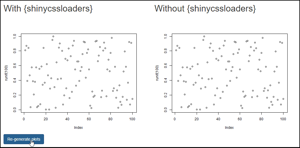
Simply wrap a Shiny output in a call to withSpinner().
If you have %>% loaded, you can use it, for example
plotOutput("myplot") %>% withSpinner().
Basic usage:
library(shiny)

ui <- fluidPage(
    actionButton("go", "Go"),
    shinycssloaders::withSpinner(
        plotOutput("plot")
    )
)
server <- function(input, output) {
    output$plot <- renderPlot({
        input$go
        Sys.sleep(1.5)
        plot(runif(10))
    })
}
shinyApp(ui, server)
Using a full-page spinner:
library(shiny)

ui <- fluidPage(
    actionButton("go", "Go"),
    plotOutput("plot")
)
server <- function(input, output) {
    observeEvent(input$go, {
      showPageSpinner()
      Sys.sleep(1)
      hidePageSpinner()
    })
    output$plot <- renderPlot({
        plot(runif(10))
    })
}
shinyApp(ui, server)
You can also use {shinycssloaders} in Rmarkdown documents, as long as
they use runtime: shiny.
For most users: To install the stable CRAN version:
install.packages("shinycssloaders")For advanced users: To install the latest development version from GitHub:
install.packages("remotes")
remotes::install_github("daattali/shinycssloaders")You can use the type parameter to choose one of the 8
built-in animations, the color parameter to change the
spinner’s colour, and size to make the spinner smaller or
larger (2 will make the spinner twice as large). For example,
withSpinner(plotOutput("myplot"), type = 5, color = "#0dc5c1", size = 2).
If you don’t want to use any of the built-in spinners, you can also
provide your own image (either a still image or a GIF) to use instead,
using the image parameter.
The spinner attempts to automatically figure out the height of the
output it replaces, and to vertically center itself. For some outputs
(such as tables), the height is unknown, so the spinner will assume the
output is 400px tall. If your output is expected to be significantly
smaller or larger, you can use the proxy.height parameter
to adjust this.
Any Shiny output that uses withSpinner() will
automatically show a spinner while it’s recalculating. You can also
manually show/hide an output’s spinner using
showSpinner()/hideSpinner().
You can also use showPageSpinner() to show a full-page
spinner that will cover the entire page rather than a single Shiny
output. Full page spinners support the same parameters as regular
spinners, and can be removed with hidePageSpinner().
Use the caption parameter to add a custom message under
the spinner. The message can either be plain text
("Please wait") or HTML
(div(strong("Loading"), br(), em("Please wait"))).
If you want all the spinners in your app to share some of the
options, instead of specifying them in each call to
withSpinner(), you can set them globally using R options.
For example, if you want all spinners to be of a certain type and color,
you can set
options(spinner.type = 5, spinner.color = "#0dc5c1").
Similarly, for full-page spinners you can use
page.spinner.type, page.spinner.color, etc to
set default parameters instead of setting them in
showPageSpinner().
By default, the out-dated output gets hidden while the spinner is
showing. You can change this behaviour to have the spinner appear on top
of the old output using the hide.ui = FALSE parameter.
Sponsors 🏆
There are no sponsors yet
{shinycssloaders} is the result of many days of work, including many more to come. Show your support and become the first sponsor for {shinycssloaders}!
The 8 built-in animations are taken from https://projects.lukehaas.me/css-loaders/.
The package was originally created by Andrew Sali.