The goal of shiny.tailwind is to bring TailwindCSS to Shiny apps.
You can install the package with:
install.packages("shiny.tailwind")
# development version
# remotes::install_github("kylebutts/shiny.tailwind")In your shiny UI declaration, just include
shiny.tailwind::use_tailwind() and all the appropriate
files will be inserted into your shiny app. Therefore you can just start
using tailwind classes and they will load dynamically and
automatically.
If you want to compile your used tailwindcss classes to a local css file, see the Details section.
shiny.tailwind also allows you to use daisyUI and flowbite components. See also the
examples
system.file("examples", "07-daisyUI", package = "shiny.tailwind")
andsystem.file("examples", "08-flowbite", package = "shiny.tailwind")Here is a basic example.
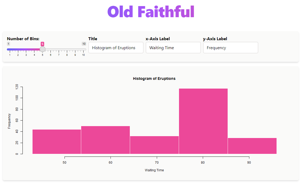
Here is the example code. Note how easy it is to use tailwind classes
with shiny.tailwind::use_tailwind()
library(shiny)
library(shiny.tailwind)
# there is a bug (at the moment), that tailwind does not render correctly in the
# RStudio viewer, the following code uses your default browser
options(shiny.launch.browser = .rs.invokeShinyWindowExternal)

# Define UI for application that draws a histogram using HTML divs and tailwind
ui <- div(
  class = "px-4 py-10 max-w-6xl mx-auto",
  # Load Tailwind CSS Just-in-time
  use_tailwind(),

  # apply tailwind classes to existing classes, in this case the slider input
  tags$style(type = "text/tailwindcss","
  .irs-single {@apply bg-pink-500 !important;}
  .irs-bar {@apply bg-gradient-to-r from-indigo-500 via-purple-500 to-pink-500 border-none !important;}
  "),

  # Title
  div(class = "flex flex-col w-full text-center py-12",
      h1(
        class = paste(
          "text-6xl font-extrabold tracking-tight text-transparent bg-clip-text",
          "bg-gradient-to-r from-indigo-500 via-purple-500 to-pink-500"
        ),
        "Old Faithful"
      )
  ),

  # Inputs
  div(class = "flex gap-2 shadow-md py-4 px-4 flex flex-row rounded-md bg-stone-50",
      twSliderInput("bins", "Number of Bins:", min = 1, max = 10, value = 5,
                    label_class = "font-bold"),
      twTextInput("title", "Title", value = "Histogram of Eruptions",
                  label_class = "font-bold",
                  input_class = "rounded-md border border-2 border-stone-200"),
      twTextInput("xlab", "x-Axis Label", value = "Waiting Time",
                  label_class = "font-bold",
                  input_class = "rounded-md border border-2 border-stone-200"),
      twTextInput("ylab", "y-Axis Label", value = "Frequency",
                  label_class = "font-bold",
                  input_class = "rounded-md border border-2 border-stone-200")
  ),

  # Plot
  div(class = "block shadow-md rounded-md py-4 px-4 mt-4 bg-stone-50",
      plotOutput("distPlot")
  )
)

# Define server logic required to draw a histogram, does not use shiny.tailwind
server <- function(input, output) {

  output$distPlot <- renderPlot({
    # generate bins based on input$bins from ui.R
    x    <- faithful[, 2]
    bins <- seq(min(x), max(x), length.out = input$bins + 1)

    # draw the histogram with the specified number of bins
    par(bg = NA) # remove white background of plot
    hist(x, breaks = bins, col = "#ec4899", border = "white",
         main = input$title, xlab = input$xlab, ylab = input$ylab)
  })
}

# Run the application
if (interactive() == TRUE) shiny::shinyApp(ui = ui, server = server)
Additional examples are found in the inst/examples/
folder, eg
library(shiny)
library(shiny.tailwind)

list.files(system.file("examples", package = "shiny.tailwind"))
runApp(system.file("examples", "01-old-faithful", package = "shiny.tailwind"))
At the moment the following examples are available:
01-old-faithful02-Scrollytelling03-css-generation04-shiny-inputs05-apply-directive06-sidebar-dashboard07-daisyUI08-flowbite09-nested-tabsets10-modalTailwind CSS is a utility-based CSS framework that allows really quick and incredibly customizable styling of html all through classes. Here are some example classes
my-4 which sets the margin top and
bottom (ie the y coordinates) to size 4
(Tailwind has sizes that are consistent across classes. 4 happens to be
1rem). See also docs/margin.shadow-sm/shadow-md/shadow-lg/shadow-xl
set a drop shadow on divs. See also docs/box-shadow.text-left/text-center/text-right
left/center/right- align text. See also docs/text-align.w-#/12 sets a column of width #/12 (similar to
bootstrap’s grid). See also docs/width.For example, the following UI code would create a div that has a
margin of 4 tailwind units vertically (my-4), a large
shadow (shadow-lg) and has a width of 3/12
(w-3/12):
div(
  class = "my-4 shadow-lg w-3/12",
  ... # put the contents of the box here.
)
This makes a common framework for designing that is quick and intuitive.
shiny.tailwindTailwindCSS is a utility-based design framework that makes designing simple. There is basically a class for every css idea you could have. However, the complete set of tailwind css classes is massive (~15mb), so you don’t want to load all of these. That is where Tailwind’s new Just in Time compiling comes in. It will only load the css classes you use, as you use them. So if your shiny app renders ui dynamically, it will load just the css needed whenever the UI is rendered.
Normally, doing just in time requires a fancy node setup that is constantly monitoring html in a terminal. However, the company Beyond Code created a browser version of Tailwind Just in Time that runs completely in JS in the browser. See https://beyondco.de/blog/tailwind-jit-compiler-via-cdn. Therefore, you can just use tailwind css classes and they will load automatically.
If you need to work offline or do not want to have the live-connection required to tailwinds CDN, you can also install and use the CLI which will compile the required css to a local file. See also:
?install_tailwindcss_cli() to install the CLI (the
program is around 15MB and platform dependent),?compile_tailwindcss() to compile the files to a local
CSS (replaces the logic of use_tailwind() instead the local
CSS can be included),03-css-generation example
(system.file("examples", "03-css-generation", package = "shiny.tailwindcss")).@apply directive:Writing css in Tailwind is incredibly easy too, with the @apply
directive. For example, lets say you want to create a blue button class,
say .btn-blue. I can use the @apply directive
to automatically use a bunch of TailwindCSS utility classes:
.btn-blue {
  @apply bg-blue-500 hover:bg-blue-700 text-white;
}
Setting class = "btn-blue" is equivalent to setting
class = "bg-blue-500 hover:bg-blue-700 text-white".
You can write custom css files for your shiny app, you just need to
pass them through use_tailwind() in order to use the apply
directive. Just pass use_tailwind(css = "custom.css") and
the @apply directive
will work automatically. (Technical note, the <style>
tag that holds the custom.css needs the property
type='postcss' in order to work, and use_tailwind does this
automatically.)
See also the 05-apply-directive,
which you can run with
runApp(system.file("examples", "05-apply-directive", package = "shiny.tailwind"))As the official
tailwindcss documentation puts it, the best way to reuse classes is
to define loops and components. For example, let’s say we want to have a
multiple containers with the classes
p-2 bg-stone-200 border border-gray-600 rounded-md drop-shadow-md,
we could either re-type this string every time, or use something along
the lines of this:
mybox <- function(...) {
  div(
    class = "p-2 bg-stone-200 border border-gray-600 rounded-md drop-shadow-md",
    ...
  )
}

# in UI:
div(
  class = "flex flex-wrap",
  mybox("This is the first box"),
  mybox("This is a second box"),
  mybox("This is a third box"),
)Custom configuration of Tailwind is also possible. There are two
options available in ‘use_tailwind’, but moving forward the option
tailwindConfig will be the only one supported (with version
3.0 of Tailwind). See this
release for details, but you need to define
tailwind.config = {} as a JSON object. An example is in the
folder ‘inst/examples/01-old-faithful’ in the github repository. Note
the ‘.js’ file should only consist of the JSON object. The function will
place it in the appropriate script tag. For details on all the ways you
can configure Tailwind, see this page in their
docs.
Version 3 of tailwind (the default by use_tailwind) will
come loaded with all first-party plugins from Tailwind, i.e. Typography,
Aspect Ratio, Forms, Line-clamp.
For version 2, if you want to use custom modules, for example TailwindTypography, note that you need to use the browser-version and you have to layout the config file in a specific way. You need to define the config JSON object as ‘window.tailwindConfig’ and you must call ‘window.tailwindCSS.refresh();’.