![]()
Readable, complete and pretty graphs for correspondence analysis made
with FactoMineR. Many can be
rendered as interactive html plots, showing useful informations at mouse
hover. The interest is not mainly visual but statistical : it helps the
reader to keep in mind the data contained in the cross-table or Burt
table while reading correspondence analysis, thus preventing
overinterpretation. Graphs are made with ggplot2, which means that you
can use the + syntax to manually add as many graphical
pieces you want, or change theme elements.
You can install ggfacto from CRAN:
install.packages("ggfacto")Or install the development version from github:
# install.packages("devtools")
devtools::install_github("BriceNocenti/ggfacto")Make the MCA (using a wrapper function around
FactoMineR:MCA) :
library(ggfacto)
data(tea, package = "FactoMineR")
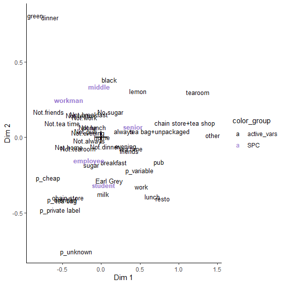
res.mca <- MCA2(tea, active_vars = 1:18)Make the plot (as a ggplot2 object) and add a supplementary variable
("SPC") :
graph_mca <- ggmca(res.mca, tea, sup_vars = "SPC", profiles = TRUE, text_repel = TRUE)Use text_repel = TRUE to avoid overlapping of text, and
obtain a more readable image (be careful that, if the plot is
overloaded, labels can be far away from their original location).
Use profiles = TRUE to draw the graph of individuals :
one point is added for each profile of answers.
Turn the plot interactive :
ggi(graph_mca)
It is possible to print all crosstables between active variables (burt table) into the interactive tooltips. Spread from mean are colored and, usually, points near the middle will have less colors, and points at the edges will have plenty. It may takes time to print, but really helps to interpret the MCA in close proximity with the underlying data.
ggmca(res.mca, tea, sup_vars = "SPC", active_tables = "active",
      ylim = c(NA, 1.2), text_repel = TRUE) %>%
ggi()ggmca(res.mca, tea, sup_vars = "SPC", active_tables = "sup",
ylim = c(NA, 1.2), text_repel = TRUE) %>%
ggi()ggmca(res.mca, tea, sup_vars = "SPC", ylim = c(NA, 1.2), ellipses = 0.95, text_repel = TRUE, profiles = TRUE)
#> colors based on the following categories (rename with colornames_recode): 'SPC_employee', 'SPC_middle', 'SPC_non-worker', 'SPC_other worker', 'SPC_senior', 'SPC_student', 'SPC_workman'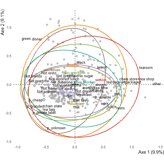
ggmca(res.mca, tea, sup_vars = "SPC", ylim = c(NA, 1.2), type = "facets", ellipses = 0.5, profiles = TRUE)
#> colors based on the following categories (rename with colornames_recode): 'SPC_employee', 'SPC_middle', 'SPC_non-worker', 'SPC_other worker', 'SPC_senior', 'SPC_student', 'SPC_workman'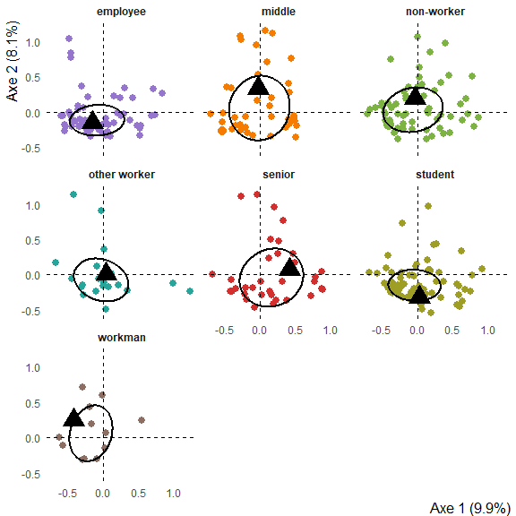
Make the correspondence analysis :
tabs <- tabxplor::tab_plain(forcats::gss_cat, race, marital, df = TRUE)
res.ca <- FactoMineR::CA(tabs, graph = FALSE)
Interactive plot :
graph.ca <- ggca(res.ca,
                 title = "Race by marical : correspondence analysis",
                 tooltips = c("row", "col"))
ggi(graph.ca)
Image plot (with text_repel to avoid overlapping of
labels) :
ggca(res.ca,
     title = "Race by marical : correspondence analysis",
     text_repel = TRUE, dist_labels = 0.02)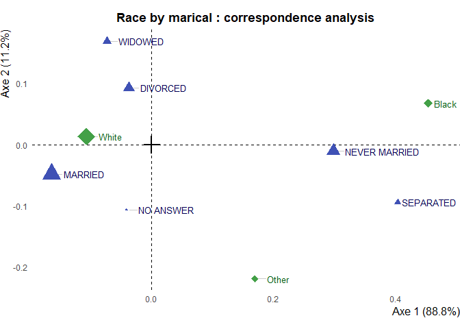
Step-by-step functions can be used to create a database with all the necessary data, modify it, then use it to draw the plot:
library(dplyr)
library(ggplot2)

plot_data <- ggmca_data(res.mca, tea, sup_vars = "SPC")

plot_data$vars_data <- plot_data$vars_data %>%
  filter(!lvs %in% c("other worker", "non-worker"))

ggmca_plot(plot_data, ylim = c(NA, 1.2), text_repel = TRUE)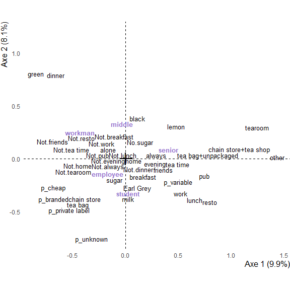
The plot can always be modified using the ggplot2
+ operator :
ggmca_plot(plot_data, ylim = c(NA, 1.2)) +
labs(title = "Multiple correspondence analysis") +
theme(axis.line = element_line(linetype = "solid") )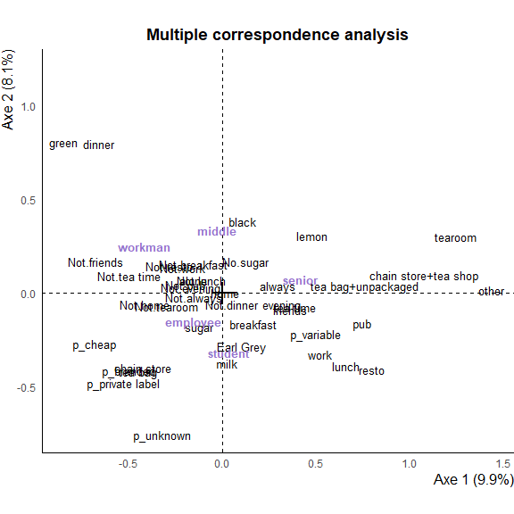 You can then pass to plot to
 ggi() to make it
interactive.
Set use_theme = FALSE to use you own ggplot2 theme :
ggmca_plot(plot_data, ylim = c(NA, 1.2), use_theme = FALSE) +
  theme_classic()