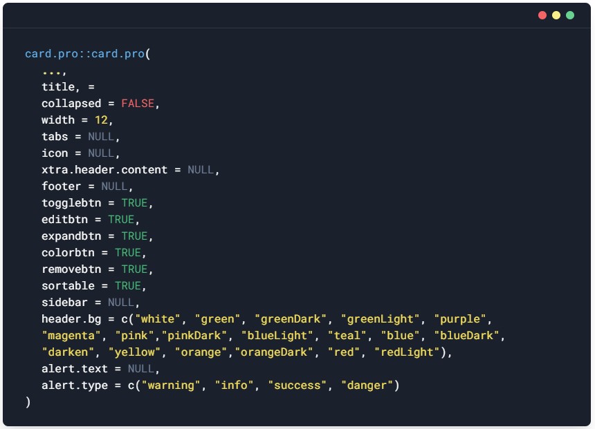

This high customization card.pro() component provides a flexible and extensible content container with multiple variants and options. It allows shiny app developers to display content in an organized and uniform manner in the form of cards.
While is merely a flexible div with a lot of options for customization, You can add images, text, lists and other content inside. It allows options to help style the title and text respectively.
For layout, you can stack multiple cards within a moveable() container and make them moveable by the user.
There are options for you to include toolbars that extensively improve the card functionality.
A great feature of this package is that you are able to rearrange the cards on the page, change titles, change header color, expand cards. When you refresh the page, the changes are preserved across refresh and various sessions.
install.package("card.pro")
library(shiny)
library(card.pro)


ui <- fluidPage(

  titlePanel("Advanced Card: Expand, Edit, Rearrange and Refresh"),

  use.cardpro(theme = "a"), # themes a,b,c,d, or e

  # add card
  moveable(
    card.pro("History something",title = "A random content", collapse=TRUE),
    card.pro("Card B","cONTENT 2", title = "a title", width = 4, header.bg = "darken"),
    card.pro("Card C",title ="Card 3", width = 8, header.bg = "red"),


    card.pro(
      "Hello graph",
      sidebar = div(
        "Plot settings",
        textInput("testy", "Y-axis title", "Concentration"),
        textInput("testx", "X-axis title", "Time"),
        textInput("dpi", "Image dpi", "300"),
        textInput("strp", "Subset", "NA"),
        actionButton("test3", "Re-graph")
      ),
      title = "Card with side bar",
      width = 6,
      icon = icon("globe"),
      header.bg = "blue",
      footer = "Footnote or legend..."
    ),


    card.pro(
      "Lorem ipsum odor amet.",
      title = "Card with tabs",
      width = 6,
      icon = icon("fire"),
      tabs = list(
        tabEntry("Tab 1",
                 textInput("nor1", "Enter name"), "Content for 1"),
        tabEntry("Tab 2",
                 actionButton("nor1", "Try to click"), "sample")
      )
    )
  )

)

shinyApp(ui = ui, server = empty.server)