




This package aims to make network visualisation easier, succinct, and consistent. Visualisation is a key part of the research process, from the initial exploration of data to the analysis of results and the presentation of findings in publications. However, it is often a tedious and time-consuming task. Trying to wrangle these into a consistent style for publication or presentation can be frustrating and requires a lot of code. While there are a number of excellent packages for network analysis in R, they each face several of the following challenges when it comes to visualisation:
{autograph} aims to solve these problems by providing
automatic graph drawing for networks in any of the
{manynet} formats, and automatic plotting for results from
{stocnet} packages, including {migraph},
{RSiena}, and {MoNAn}, and more.
All you need to do is install the package (loading it last will make
sure its plotting methods are the default), use
set_stocnet_theme() (once) to set your preferred theme, and
then use graphr() to graph your networks, or
plot() to plot your results. That’s it!
{autograph} includes three one-line graphing functions
with sensible defaults based on the network’s properties.
First, graphr() is used to graph networks in any of the
{manynet} formats. Because it builds upon
{manynet}, it can graph networks in any of the
{manynet} formats, including network,
igraph, sna, tidygraph, and
more.
Second, it includes sensible defaults so that researchers can view
their network’s structure or distribution quickly with a minimum of
fuss. Compare the output from {autograph} with a similar
default from {igraph}:
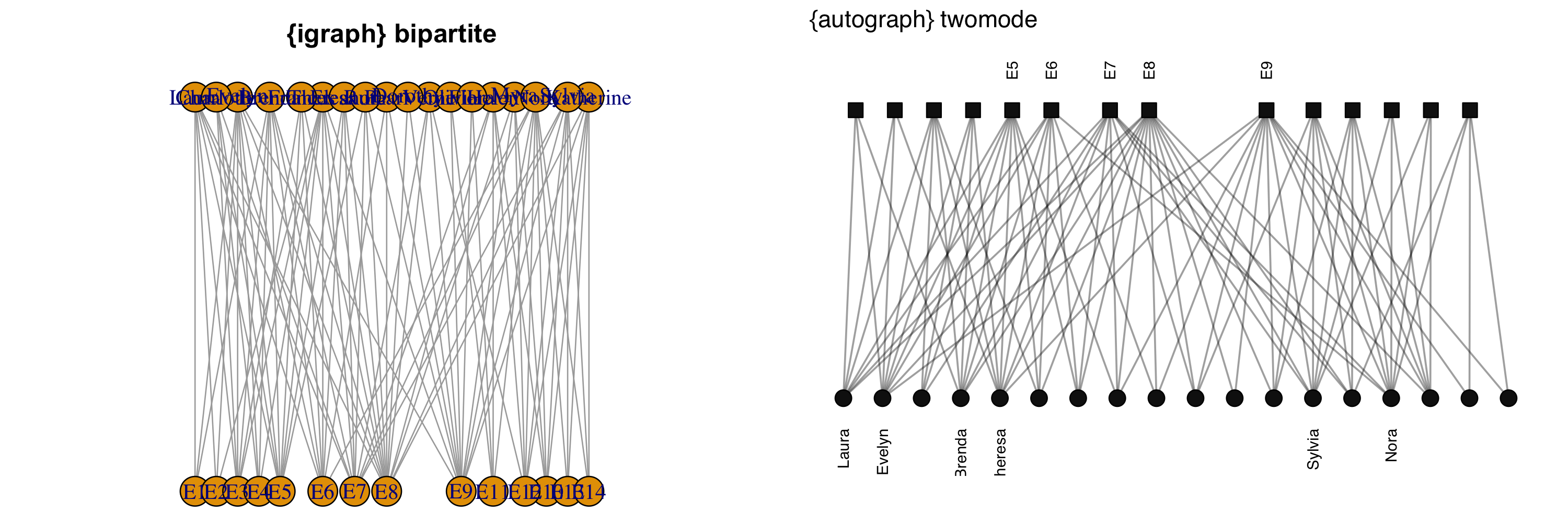
{igraph} requires the bipartite layout to be specified,
has cumbersome node size defaults for all but the smallest graphs, and
labels also very often need resizing and adjustment to avoid overlap.
Getting this default plot to look good can take a lot of trial and
error, and time. By contrast, graphr() recognises the
network as two-mode and uses a bipartite layout by default. It also
recognises that the network contains names for the nodes and prints them
vertically so that they are legible in this layout. Other ‘clever’
features include automatic node sizing and more.
This inference matters for more than tidiness. Where a default does not recognise a property of the network, that property is usually dropped silently. Compare the same signed network drawn by each package:
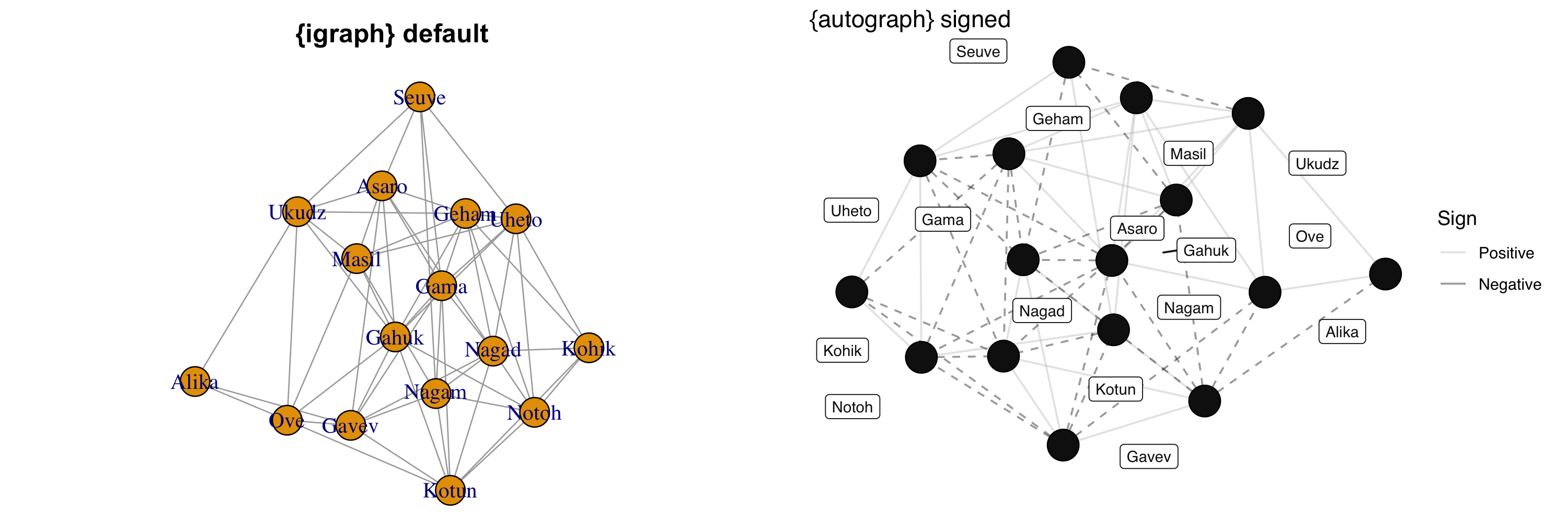
irps_tribes records both alliance and antagonism between
sixteen tribes, in equal number. {igraph} draws all of
these ties identically, so the distinction that motivates the data is
not visible. graphr() recognises the network as signed and
maps the sign to both colour and linetype, with a legend. The same
applies to weights, to self-ties, and to direction:
graphr() reads these from the network rather than requiring
you to know to ask for them.
All of graphr()’s adjustments can be overridden,
however… Changing the size and colors of nodes and ties is as easy as
specifying the function’s relevant argument with a replacement,
e.g. node_color = "darkblue" or node_size = 6,
or indicating from which attribute it should inherit this information,
e.g. node_color = "Office" or
node_size = "Seniority".
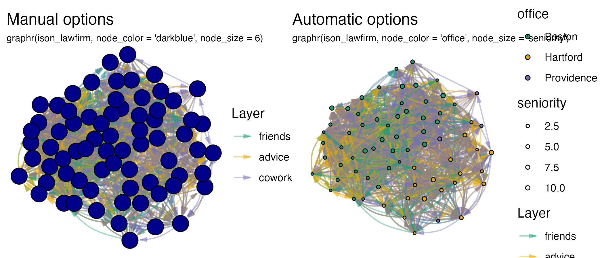
Legends are added by default when node or tie aesthetics are mapped
to attributes, but can be removed with show_legend = FALSE.
Since the {autograph} builds upon {ggplot2},
titles, subtitles and, for plotting, axis labels can all be added on
easily, or other elements (e.g. font size) can be tweaked for a
particular output.
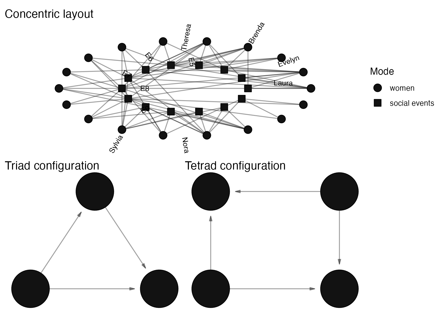
graphr() can use all the layout algorithms offered by
packages such as {igraph}, {ggraph}, and
{graphlayouts}. {autograph} also offers some
additional layout algorithms for visualising layers horizontally,
vertically, or concentrically, conforming to configurational
coordinates, or for snapping these layouts to a grid.
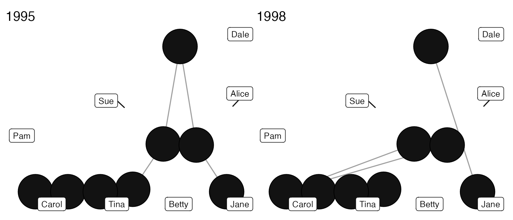
The second graph drawing function included, graphs(), is
used to graph multiple networks together. This can be useful for ego
networks or network panels. {patchwork} is used to help
arrange individual plots together, and is used throughout the package to
help arrange plots together informatively.
graphs() computes one layout and holds it across every
panel. Plotting each network separately gives each panel its own layout,
so a node can appear in a different position in each panel even where
nothing about that node has changed. Holding the layout constant makes
the panels comparable, so that what moves on the page is what changed in
the data. graphs() also collects a single legend for the
whole set.
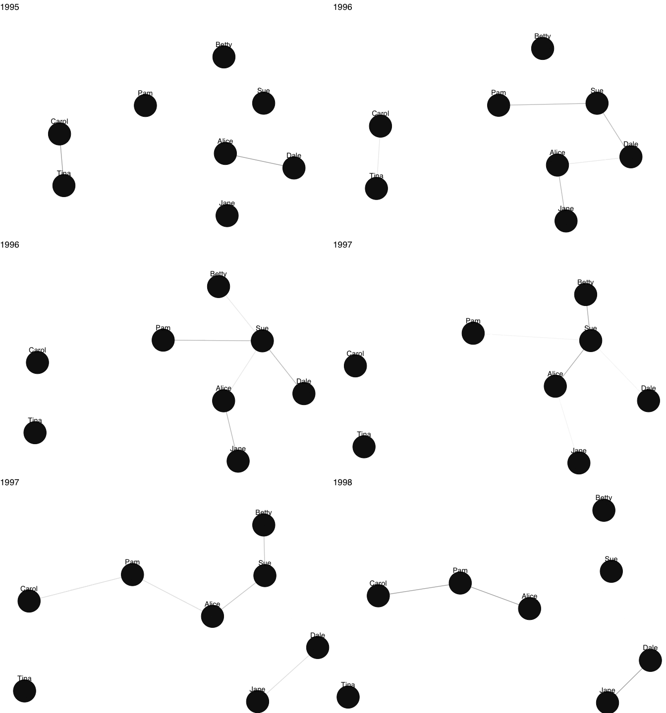
The third graph drawing function, grapht(), is used to
visualise dynamic networks. It uses {gganimate} and
{gifski} to create a gif that visualises network changes
over time, with node positions transitioning smoothly between waves and
nodes fading in and out as they enter and exit the network. It really
couldn’t be easier.
Since network analysis involves not just drawing graphs,
{autograph} also provides a function for plotting results
from the analysis or modelling of those networks. To keep things simple,
all users need to remember is a single, generic function:
plot(). Method dispatching takes care of the rest, so you
can concentrate on exploring and interpreting your results.
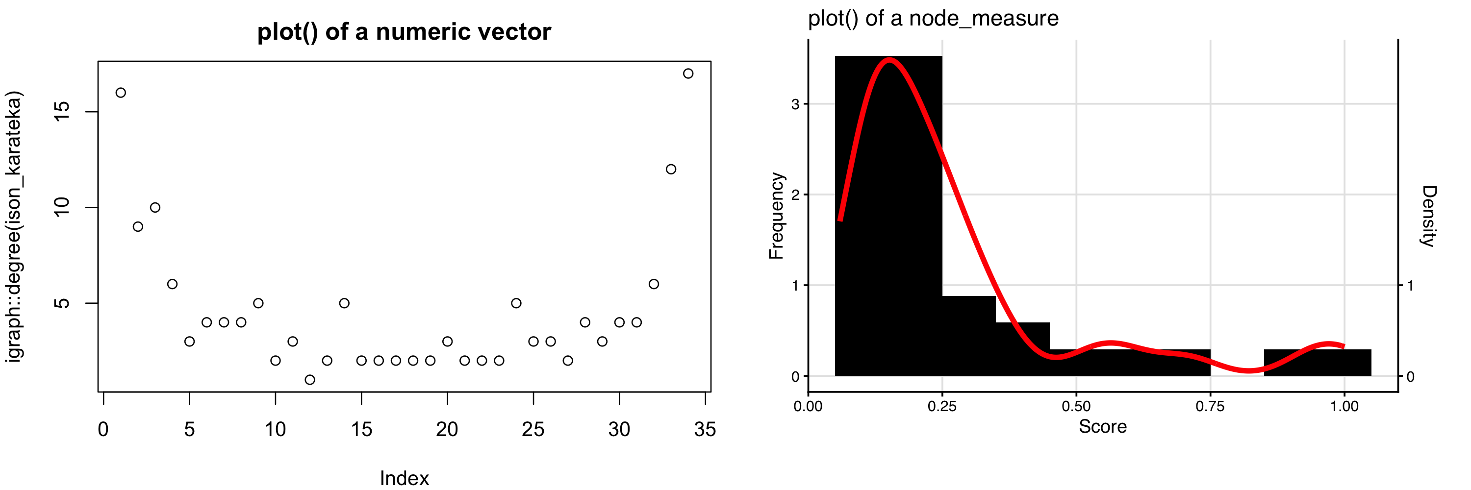
Dispatching works because the results carry a class.
igraph::degree() and sna::degree() each return
a bare numeric vector, so plot() falls back to a
scatterplot of the values against their index, and that index is not
meaningful. netrics::node_by_degree() returns a
node_measure, which {autograph} plots as a
themed distribution:
The same holds for the other result classes. Here are some further
examples, using goodness-of-fit results from fitting a SAOM in
{RSiena} and an ERGM in {ergm}. (Note that
neither the data nor the model are similar; this is just for
illustrative purposes.)
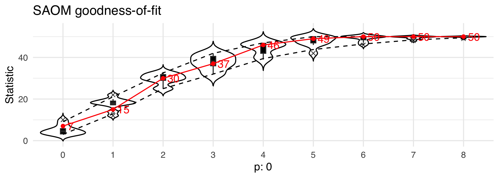
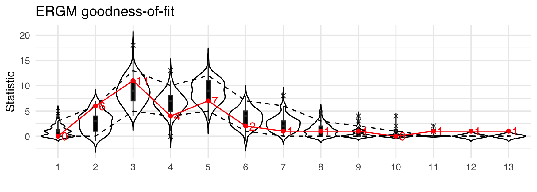
Note that in the above plots, the same colour scheme and fonts were
used. They can be easily changed though. {autograph}
includes a number of themes that can be used to style all graphs and
plots consistently. And it is very easy to set a theme. Just type
stocnet_theme() to see which is the theme currently set,
and to get a list of available themes. Then enter the chosen theme name
in the function to set it. All plots created using
{autograph} functions will then use this theme, until you
change it again.
stocnet_theme()
(plot(netrics::node_by_degree(ison_karateka)) +
plot(netrics::tie_by_betweenness(ison_karateka)))/
(plot(netrics::node_in_regular(ison_southern_women, "e")) +
plot(as_matrix(ison_southern_women),
     membership = netrics::node_in_regular(ison_southern_women, "e")))
stocnet_theme("ethz")
(plot(netrics::node_by_degree(ison_karateka)) +
plot(netrics::tie_by_betweenness(ison_karateka)))/
(plot(netrics::node_in_regular(ison_southern_women, "e")) +
plot(as_matrix(ison_southern_women),
     membership = netrics::node_in_regular(ison_southern_women, "e")))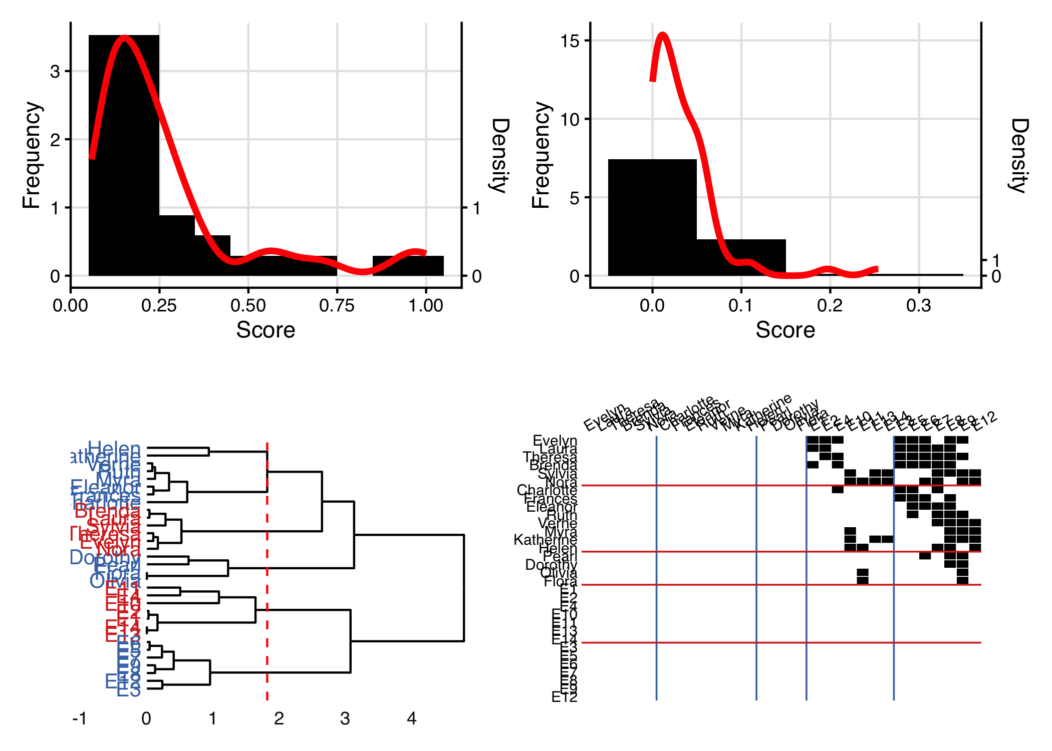
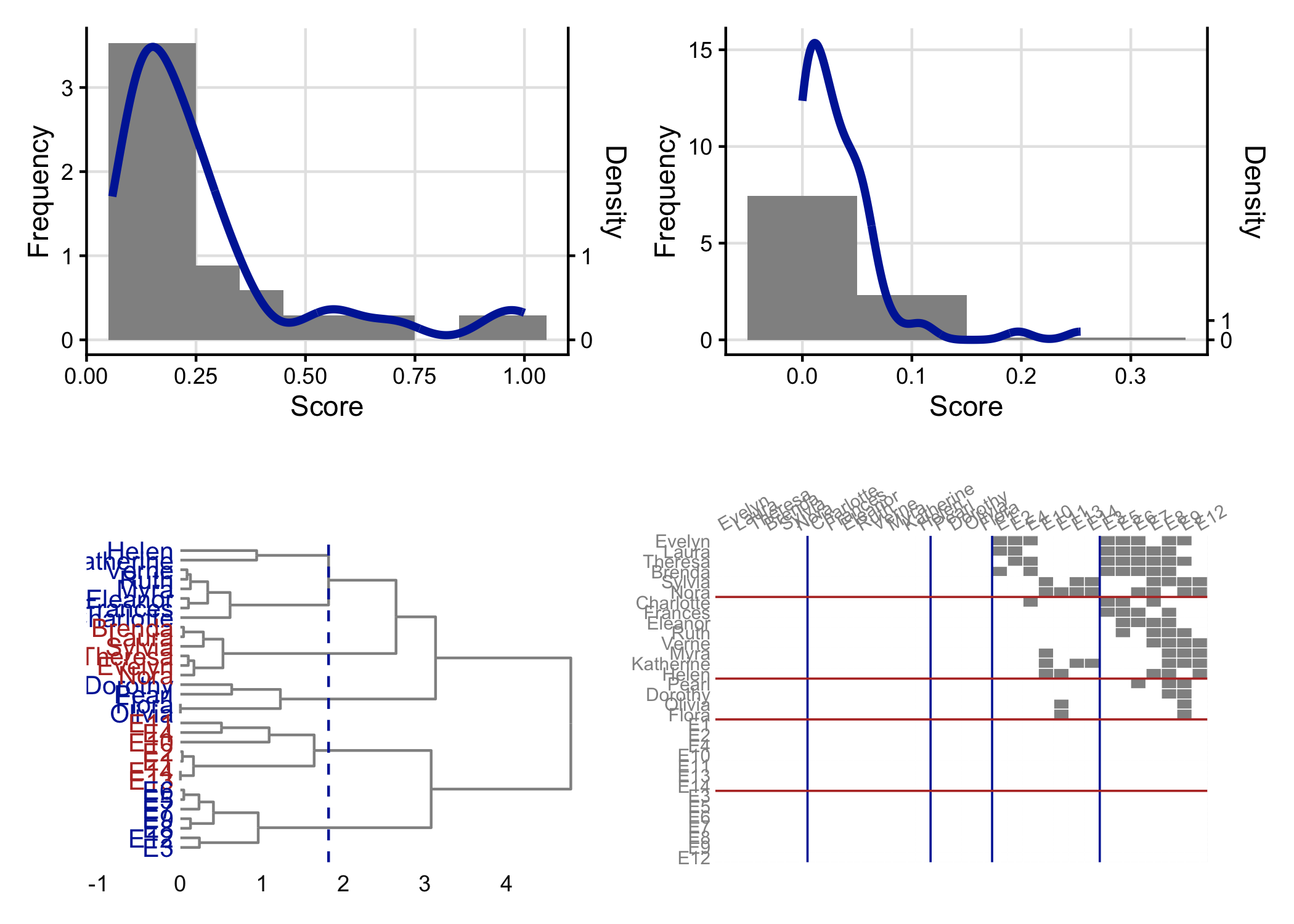
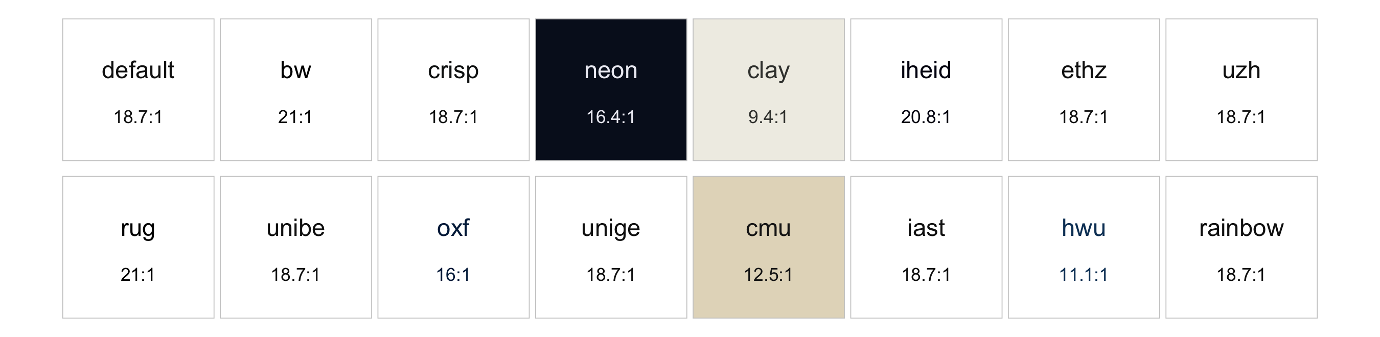
There are a range of institutional and topical themes available, including default, bw, crisp, neon, clay, iheid, ethz, uzh, rug, unibe, oxf, unige, cmu, iast, hwu, rainbow, with more on the way.
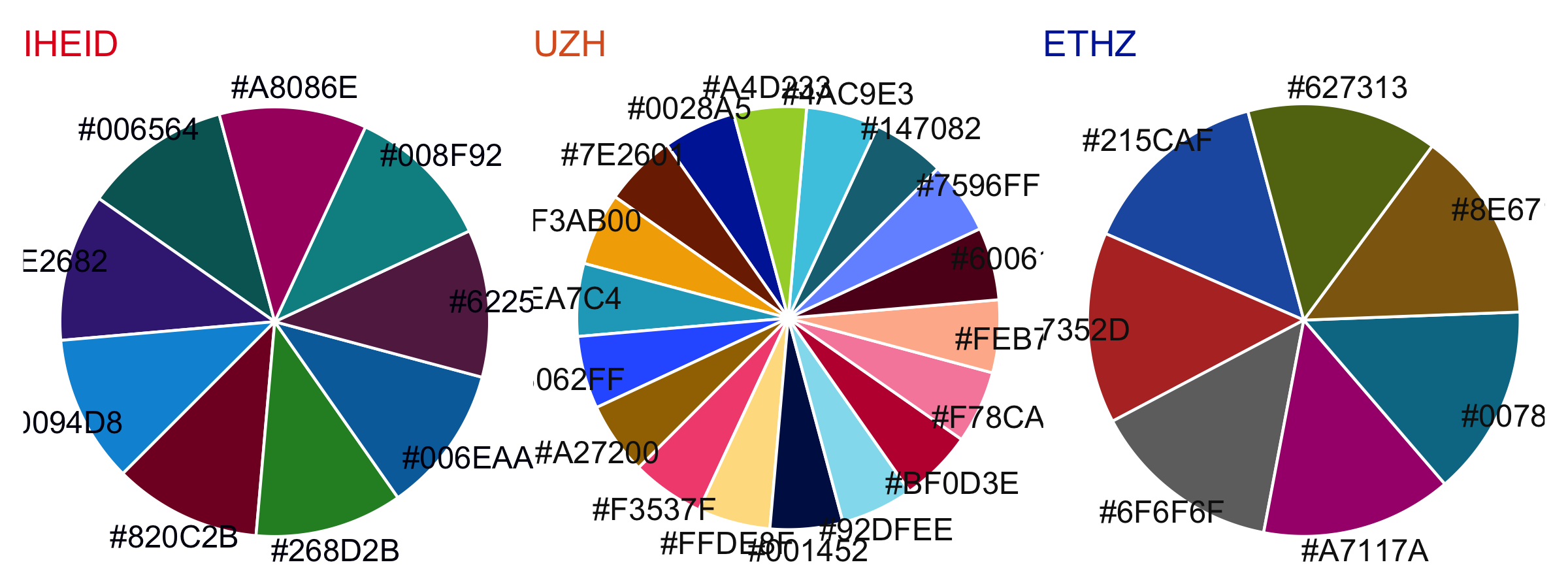
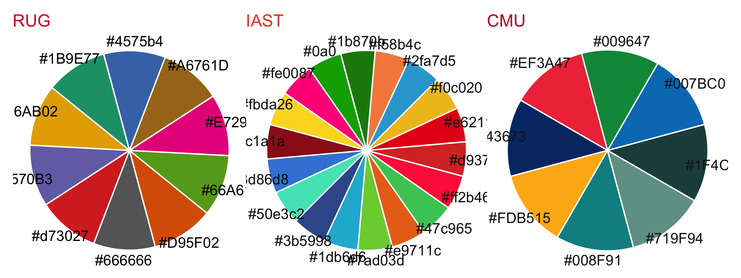
About one man in twelve, and one woman in two hundred, sees colour differently. A palette that separates its categories for most readers can collapse for them, and the classic offender is the red-green pair that so many palettes hold.
{autograph} does something about this without asking you
to give up a palette. Every theme’s categorical palette is reordered
when the theme is set, so that the colours a graph reaches for first are
those that stay distinct under each type of colour blindness, and each
divergent palette pairs a warm pole with a cool one.
simulate_colorblind() shows a set of colours as another
viewer sees them, so mapping the simulated colours back onto a graph
shows you their view of it. Here is the same network four times: in
{autograph}’s default palette as most readers see it, then
as a reader with deuteranopia does, then as a photocopier renders it,
and then in the palette {ggraph} falls back on when
{autograph} is not setting the colours, as that same reader
with deuteranopia sees it.
set_stocnet_theme("default")
as_seen <- function(colours, type, title){
  graphr(fict_lotr, node_colour = "Race", node_size = 3, labels = FALSE) +
    ggplot2::scale_fill_manual(values = simulate_colorblind(colours, type)) +
    ggtitle(title)
}
as_seen(ag_qualitative(6), "normal", "autograph") |
  as_seen(ag_qualitative(6), "deutan", "autograph, deuteranopia") |
  as_seen(ag_qualitative(6), "grey", "autograph, greyscale") |
  as_seen(scales::hue_pal()(6), "deutan", "ggraph default, deuteranopia")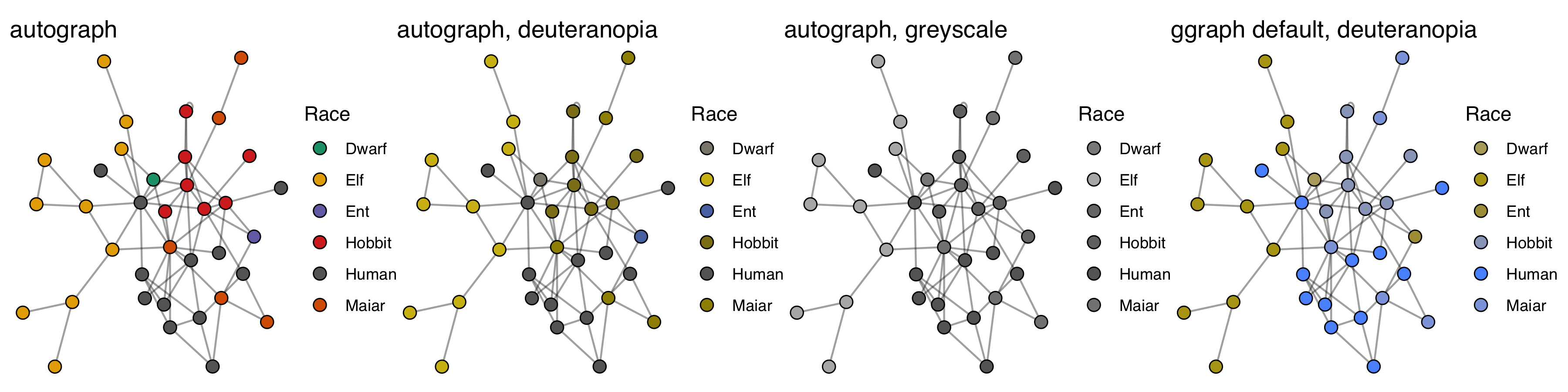
The six races remain tellable apart in the second panel, its closest
pair being Hobbits and Maiar. In the right-hand one, Elves and Ents have
become the same olive. The third panel is the harder case, and it is not
one reordering can fix: a greyscale device keeps only the luminance of a
colour, so two colours of the same lightness merge however different
their hues. check_separation() reports that view beside its
own score; where a figure has to print in black and white, use the
"bw" theme or add a second channel such as
node_shape. check_separation() puts a number
on it, scoring how far apart colours are at their worst across normal
vision and each type of colour blindness:
round(min(check_separation(ag_qualitative(6)), na.rm = TRUE), 1)             # autograph
#> [1] 13.5
round(min(check_separation(scales::hue_pal()(6)), na.rm = TRUE), 1)          # ggraph
#> [1] 5.5
round(min(check_separation(igraph::categorical_pal(6)), na.rm = TRUE), 1)    # igraph
#> [1] 16.2
Below 10 two colours are easily confused, above 25 they are
comfortably distinct. {igraph}’s categorical palette is the
Okabe-Ito scheme, which was designed for this and scores accordingly:
where you are free to choose any colours at all, such a scheme is hard
to beat, and graphr() will happily take it. The harder case
is the one {autograph} is built for — colours chosen by
somebody else, for reasons that were not legibility — and there the
ordering is what stands between a brand palette and an unreadable graph.
A palette with more colours to draw on has more room to gain: six
categories score 29 under the "hwu" theme and 26 under
"oxf".
Marks are only half of it. Text has to be read rather than told
apart, which is a matter of contrast rather than of hue, and
check_contrast() scores it against the thresholds of WCAG
2.1: 4.5 for body text, 3 for large text and for graphical objects.
Every theme’s ink clears 4.5 on that theme’s own ground, and the test
suite holds it there.
The medium is a separate question again.
stocnet_medium() sizes the text for where the figure will
be seen — "screen", "presentation",
"mobile" — and "print" draws on white whatever
ground the theme prefers, since a tinted ground costs ink and is often
not reproduced. The theme is untouched by it, so one institutional
palette carries from the desk to the slide to the page.
If your institution or organisation is not included and you would like it to be, please just raise an issue on Github, along with a link to your corporate branding or style guide if available, and we will attempt to add it at the next opportunity.
In sum, while there is a lot of clever defaults and customisation available, all it takes is three simple functions for your
The easiest way to install the latest stable version of
{autograph} is via CRAN. Simply open the R console and
enter:
install.packages('autograph')
library(autograph) will then load the package and make
the data and tutorials (see below) contained within the package
available.
For the latest development version, for slightly earlier access to new features or for testing, you may wish to download and install the binaries from Github or install from source locally. The latest binary releases for all major OSes – Windows, Mac, and Linux – can be found here. Download the appropriate binary for your operating system, and install using an adapted version of the following commands:
install.packages("~/Downloads/autograph_winOS.zip", repos = NULL)install.packages("~/Downloads/autograph_macOS.tgz", repos = NULL)install.packages("~/Downloads/autograph_linuxOS.tar.gz", repos = NULL)To install from source the latest main version of
{autograph} from Github, please install the
{remotes} package from CRAN and then:
remotes::install_github("stocnet/autograph")remotes::install_github("stocnet/autograph@develop")Those using Mac computers may also install using Macports:
sudo port install R-autograph
Development on this package has been funded by the Swiss National Science Foundation (SNSF) Grant Number 188976: “Power and Networks and the Rate of Change in Institutional Complexes” (PANARCHIC).